5 Mobile Onboarding Principles for Wooing New Users
Published on January 05, 2017/Last edited on January 05, 2017/8 min read


Team Braze
Every month (being the loyal mobile user I am), I browse through Apple’s App Store looking for new apps to download. I’ll usually try five or so apps to see if they have the features that I want. However, after a few seconds, what ends up happening is me uninstalling every app that I downloaded—mainly because I couldn’t figure out how to use them and didn’t want to spend time figuring it out.
Marketers have a very short window when it comes to making a first impression on new users. During a user’s very first session, you only get a few seconds to help them become more familiar with your app and understand your app’s value and core features. Screw that up, and those users may end up in your uninstalled segment.
An effective mobile onboarding campaign that’ll educate and boost engagement and subsequent retention is made up of five core elements: introductory content, permissioning, multichannel messaging, testing, and measurement. Here’s how to incorporate all five elements into your onboarding strategy, with some real-world examples to give you an idea of how other companies are successfully engaging new users during onboarding.
Want this blog post in video format? Watch it now.
Mobile onboarding best practices:
Make a good first impression with introductory content
One common mobile app onboarding stumble is the omission of introductory content—that is, the content you see when you first install and open an app. Introductory content is your app’s first impression. It’s the handshake and the smile that’s essential to starting the customer-brand relationship off on the right foot. In many cases, introductory content consists of several screens that explain the value of the app and discuss key features for functionality. Some apps will keep it to one to three screens, some will go to five, but either way it’s an essential part of mobile onboarding.
When building your introductory content, here are five tips to keep in mind:
- Provide length indicators. Give new users a sense of how long it’ll take to get through your introductory content. Some users will get discouraged if they’re swiping with no end in sight.
- Provide an option to leave the intro. Some new users may already have an account and want to just hop right in. Give them the ability to do so.
- Show the app’s value and functionality through images. Words are great, but images are more powerful and may provide more direction.
- Keep it short. Don’t ramble. Try to explain your app’s value in a few sentences spread across the introductory screens.
- Include your brand identifiers (e.g. logo and tagline) to let new users know who your brand is and what it’s all about.
Onboarding is the handshake and the smile for new app users.
An example from iHeartRadio
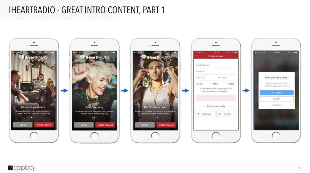
In the first three screens of iHeartRadio’s introductory content, they immediately explain the value of the app and how I can benefit. At any point, I can create an account or log in.
After the third screen, I have to either log in or create an account. As a new user, I choose to create an account, which takes me to the fourth screen. This is when I’m prompted to fill out brief information about myself.
After creating an account, they immediately ask to use my location or ZIP code to serve me the best DJs and radio stations. They explain the value in the prompt itself.
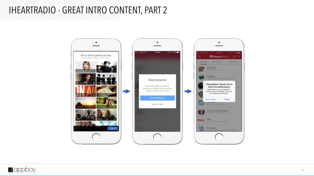
After pressing “No Thanks,” they prompt me to select my favorite genres so they can suggest tailored stations.
Once I select my favorite genres, they prime me for push! They explain the value of getting push notifications, and ask me with a custom prompt.
Once I accept, I then receive the native OS prompt, which I also allow. Then, I’m taken to the main screen.
A nice, well thought-out flow that will set me on my way to engagement.
Ask the right way with permissioning
One of the best ways to provide value to users is through features like push notifications and location tracking. Users have to opt in to these features to reap the benefits. And if you want them to do that, there’s a right way to ask for permission—whether you want to send them push notifications, gather location data, or access a user’s photos.
When it comes to permissioning, you want do four things:
- Use a custom opt-in dialogue. Custom opt-in dialogues give you the ability to ask for permissions in your own way and instill your brand’s personality into the dialogue.
- Your custom opt-in dialogue should show before the native OS dialogue. The reason is once the native OS dialogue shows, you won’t get another chance to ask for permission. A user would have to go through their settings to opt in (and most don’t know how to, or just plain won’t).
- Test your prompts to see which variants generate the most opt-ins.
- Be sure to explain to users why you’re asking for certain permissions. Don’t just ask without giving them a reason why. Explain the benefits of getting push notifications, having their location enabled, and more.
An example from Hopper
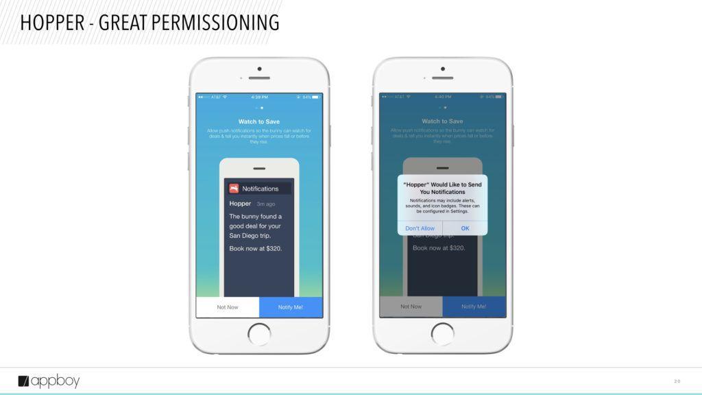
During Hopper’s intro screens, you can see on the left that they’ve created a custom push opt-in prompt, explaining the value of push. If I deny, they get a second chance to ask later on. Once I accept, the native OS prompt shows. A great use of priming and custom prompts, which in this case is a fullscreen modal.
Boost retention with multichannel messaging
The third element to onboarding is using multichannel messaging. Our research shows that apps that run multichannel onboarding campaigns during the first seven days after install see a 130% increase in two-month retention versus 71% for campaigns that only use push notifications.
Here are two tips for building your multichannel messaging strategy:
- Supplement push notifications with other channels like email, in-app/in-browser messages, or Appboy’s streaming News Feed Cards. Explaining the value of your app may require more than one channel, so don’t be afraid to leverage other channels to get your point across.
- If your app requires registration for full functionality, let users know through push notifications that there’s more to do to get the full experience. Some people may quit onboarding early for many reasons. You don’t have to give up on them. Sometimes people just need a little reminder.
An example from TripIt
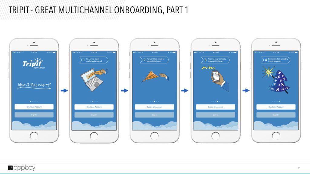
TripIt’s intro content explains the functionality of the app in five screens. At any point, I can leave the intro and create an account or sign in. They also do a good job of illustrating the process for storing an itinerary, no matter how fantastical it may be.
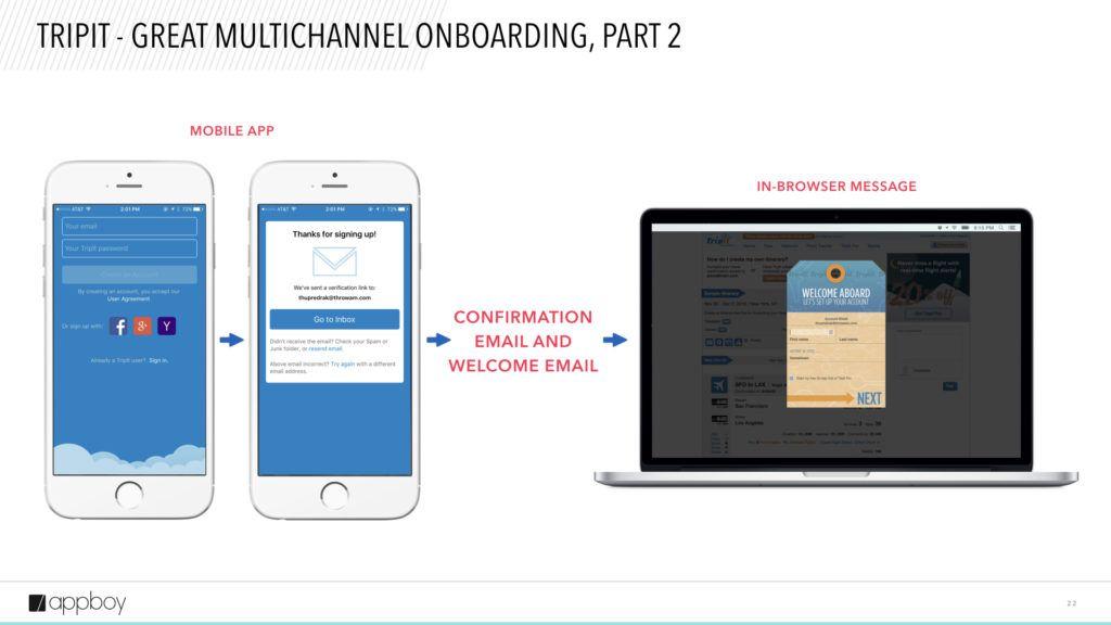
After I decide to create an account through the app, they send a confirmation email and subsequent welcome email that reiterates the value of their service.
When I click the link in the confirmation email via my laptop, I’m taken to their site that greets me with an in-browser message. The message tells me to enter more information about myself to complete my profile.
In this example, they’ve used three channels: in-app messaging, email, and in-browser messaging to guide me through the process. A great use of multiple channels.
Optimize your onboarding flow by testing
The fourth key to great onboarding is testing.
At first, you may want to begin with just creating one onboarding flow and one messaging variant. But as you ramp up your strategy and acquisition, testing becomes critical. You’ll see better results by identifying the onboarding flow and messaging that drives the most users to your desired action.
Here are two tips for testing:
- Test your onboarding flow. This includes the content, the length, and the actions. For example, you might have one flow that has three intro screens that leads to registration page. Another flow might have five introductory screens that lead to the registration page. You can test which flow generates the highest amount of registrations.
- Test your messaging. This includes the copy, imagery, tone, and personalization of your push notifications, email, in-app messages, and News Feed content.
Test to find the onboarding flow and messaging that drives the most users to your desired action.
Measure Success
The fifth essential element of an onboarding campaign is measurement. Once you’ve finished building all the content, messaging, and flows, you have to assess performance.
Here are a couple tips for doing that:
- Measure retention. This includes classic retention, range retention, and rolling retention. Retention is probably the single most important metric you can use to determine if your onboarding campaign is creating engaged users
- Analyze the impact of onboarding on first-time purchases and registrations. For most apps, these are key metrics. First-time purchases indicate that users are interested in what you’re offering, and registrations indicate that users are interested in engaging more with your app.
There are many features and strategies you may de-prioritize and overlook when building your mobile marketing strategy, but mobile onboarding shouldn’t be one of them. Mobile onboarding can make or break your whole growth strategy. And as important as mobile onboarding is to mobile engagement, it’s only the first step in helping new users pave the rest of their journey with your brand. Make your first step your best step.
Check out the Slideshow version of this post below.
Releated Content
View the Blog
Push vs pull marketing strategy: How to balance direct and inbound approaches

Team Braze

Gamification marketing: How to drive engagement, loyalty, and retention

Team Braze

Shipping reinforcement learning that matters: Life as a Forward-Deployed Data Scientist at Braze
