A Foolproof Template for the Perfect Push Notification
Published on July 08, 2016/Last edited on July 08, 2016/7 min read
Team Braze
Dear reader: This blog post made its original debut in Appboy’s Relate Magazine. Pocket its pearls of wisdom, and then for more information, check out our new Cross-Channel Engagement Difference Report!
Updated 9/20/2016
When you’re sending your push notification campaigns, there’s a lot at stake. The subtleties can make or break the user experience. As one report from the Digital Marketing Association (DMA) points out, 78% of customers will opt out of push notifications or uninstall an app if they don’t like the messages they get. So how do you make sure that your messaging is compelling enough to engage audiences for the long haul?
Here’s a push notification template to help you stand out above the noise.
Let’s start with a short quiz: what’s wrong with this push?
When planning your push notification strategy, success comes from the subtleties: don’t let the finer details slide through the cracks. Take a look at the following hypothetical example of a push notification from an ecommerce company. To a casual observer, the example probably looks fine. But when you dig a little deeper, you’ll start to see a few flaws.
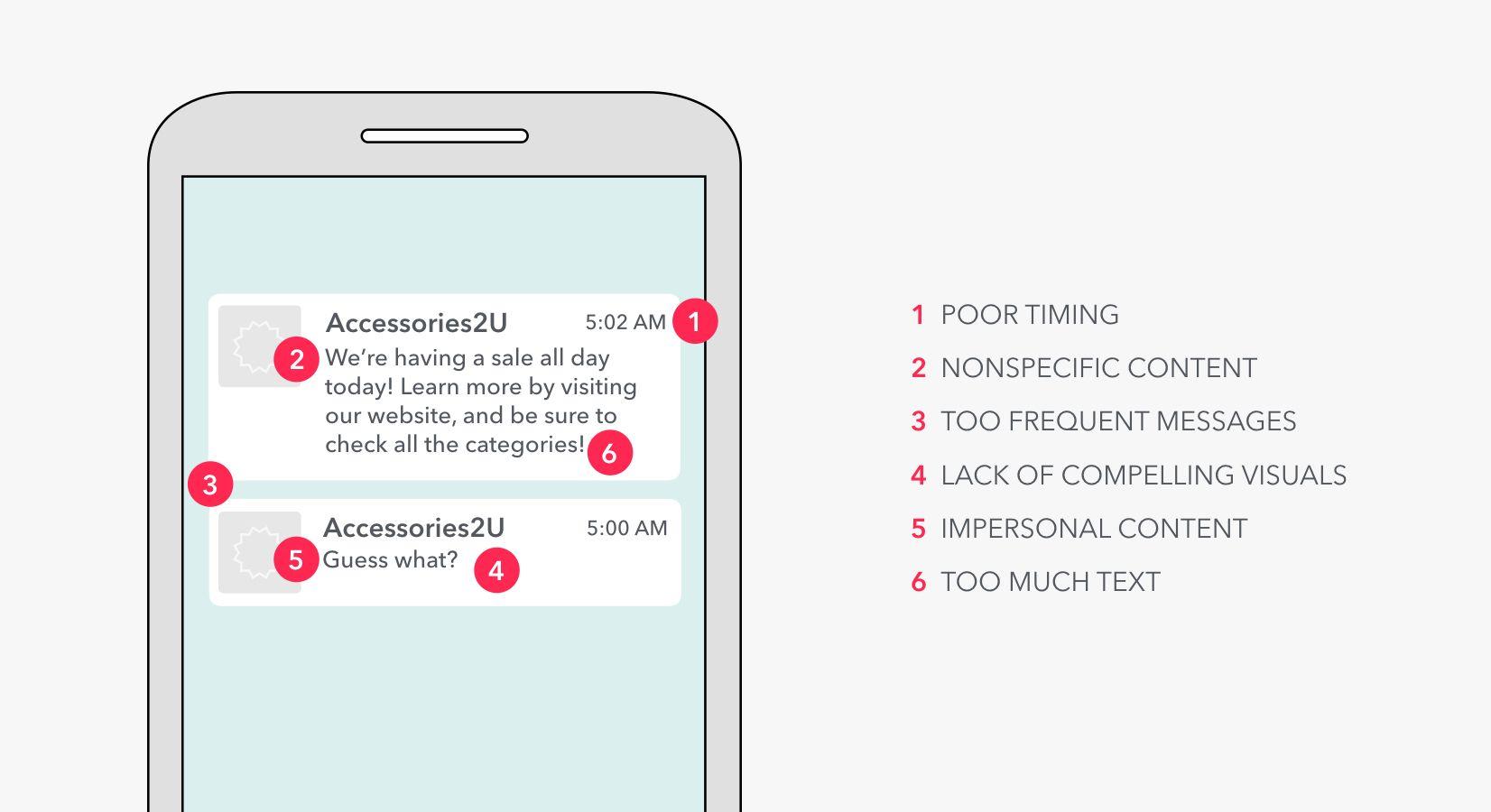
What’s wrong with these push notifications?
1. Poor timing.
Think about what you’re likely to be doing at 5:00 AM on a Saturday. Most likely, you’re asleep. What you’re not likely to be doing is scanning your phone or thinking about shopping. You might be pretty annoyed to get woken up by these messages.
2. Nonspecific content.
As a marketer, you have likely been planning this sale for months. You know all the details—but your users don’t. Push notifications provide an opportunity to get your users on the same page as your company. This push notification would have been more effective with relevant details including discount percentages or specific categories on sale.
3. Too frequent messages.
In this hypothetical example, you’ll see that the example ecommerce merchant sent not one but two push notifications back to back (within the span of 30 minutes). While this approach may seem to be a catchy way to engage users, it can actually be off-putting and come off as spammy. In some cases, it will make sense to send multiple push notifications (like possibly the first and last days of a sale), but even then, you’ll want to make sure that each message is helpful and informative. The first notification shown here doesn’t provide any value, which ties back to the point above—message content.
4. Lack of compelling visuals.
Even though your push notifications reach the palms of your users’ hands, you still only have a split second to capture their attention. When sending push notifications to both Android phones and iPhones (that are running iOS 10), you have the ability to incorporate images. And you can always include emoji.
5. Impersonal content.
You may be having a sale, but why should your users care? Dozens of your competitors have sales, too. One idea to solve this problem: personalize your messaging, and tailor the content of different push notifications to different segments of your audience. You can segment your campaign to send messages that call out scarves to regular scarf buyers, handbags to regular handbag buyers, etc.
6. Too much text.
Even though the text of this imaginary push notification isn’t saying much, there is still probably too much of it. Appboy’s research shows that the ideal length for push notifications to get the best conversion rates is 24 characters, with the second best being 50-74 characters for iOS and 25-49 characters for Android.
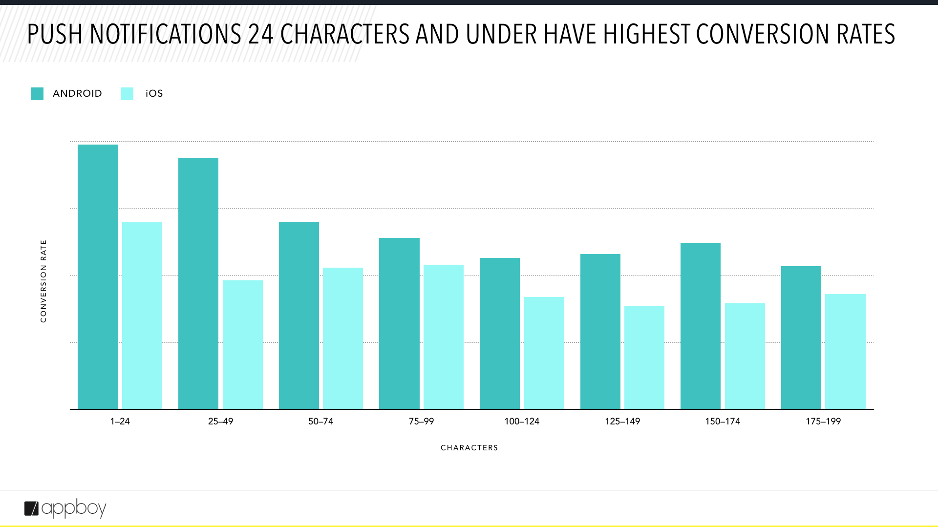
A template for effective push
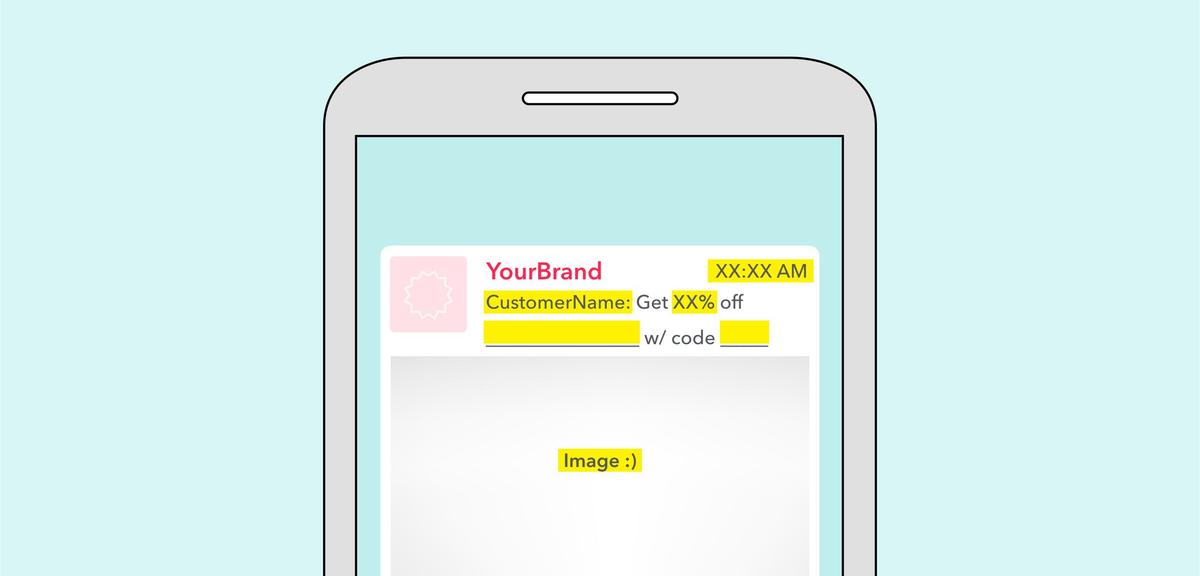
The best push notifications are timely, relevant, to the point, helpful, and non-obtrusive. So what does the anatomy of an awesome push notification look like? Here’s a notification template to help you create on-point messages every time.
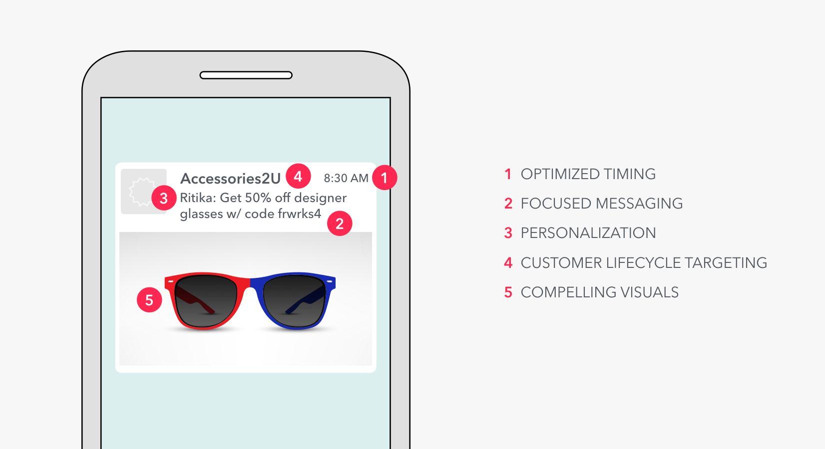
What did this push notification get right?
1. Optimized timing.
The simplest way to boost engagement with your push notifications is to send them at times of day when users are likely to engage. But don’t expect this to be one-size-fits-all. Most likely, you’ll go through a process of segmentation, testing, and refinement to find out what that optimal time is. In this hypothetical example, the ecommerce merchant likely tested messaging timing across customer segments and found 8:30 AM to be the optimal time for one particular group. Perhaps this is a time when certain audience subsets are likely to be looking at their phones—while commuting to work on a train or just sitting down at their desks, for instance.
Or, if your mobile marketing automation tool includes send-time optimization, allow it to determine the optimal moment for reaching each individual user.
2. Focused messaging.
Short, sweet, and to-the-point copy ensures that you’re always delivering the messaging that your audiences are likely to find helpful to their decision process. Simplify your messaging as much as possible, and make sure that your key takeaways are obvious.
3. Personalization.
One great simple way to make sure that your push notifications are relevant to your audiences? Address your users by name and target your outreach to specific buying behaviors. In this hypothetical example, the message not only calls out the recipient by name, the messaging is also tailored to actual buying intent and shopping behaviors.
Personalizing a message with attributes like first name, recent purchases, or other interaction data can increase conversions by 27.5% compared to generic notifications. And tailoring campaigns to carefully crafted segments (instead of sending the same message to your whole audience) can lead to a 200% increase in conversions.
4. Customer lifecycle targeting.
With every push notification, your company has an opportunity to strengthen relationships with your users. Through a process of segmentation and customer lifecycle mapping, you can ensure that your messaging is always on-point with their needs, in the moment. In this hypothetical example, this user could be one who hasn’t made a purchase in a while, and the ecommerce brand has decided to offer a high discount in order to win back her loyalty.
5. Compelling visuals.
Images and emojis can help you grab attention or add some human emotion to your message. Bonus points: you can also use images to cut down the amount of text needed to communicate your point, and emojis only count as two characters each.
Also remember
Don’t overuse your aces. You might see that adding a customer’s name to a message or packing it with emojis might cause a spike in your open or conversation rates. That’s great! But we’re willing to bet that if you keep doing that for every single message, your users might get annoyed or even just immune to these attention-grabbing tactics. Use these tactics with care and with an eye to relevance, and think about which of your campaigns are best for them.
Be a minimalist with your marketing. Too often, messaging overload can leave your recipients feeling annoyed. Set messaging limits or frequency caps based on natural user behaviors. Review your opt-out and engagement stats to figure out what’s right for your user base.
Optimize the full user journey. Create a seamless experience by paying attention to what happens after users engage with your push notifications. Rather than sending audiences to your app’s launch screen, focus on deep linking them to specific parts of your app. Here’s a deep linking guide to help you get started.
Final thoughts
From lifecycle targeting to segmentation, there’s a lot that needs to happen behind the scenes. A/B or multivariate testing can help you establish direction, fine-tune your messaging and images, and forge the clearest path forward to building out your strategy.

