6 Ways Hillary Clinton’s New App is a Masterclass in Relationship Marketing and Mobile Engagement
Published on August 16, 2016/Last edited on August 16, 2016/9 min read

Todd Grennan
Content Production Principal, Content Marketing at BrazeWhen it comes to using technology to reach people, we’re used to brands leading and political campaigns (eventually) following. It’s still common for candidates to canvass for support at in-person events and to solicit donations by repeatedly calling you at home at increasingly inconvenient times (?), but many companies are embracing mobile and other digital technologies to more effectively reach, and engage their customers in more nuanced, customized, and scalable ways.
A few recent presidential campaigns have followed the corporate world’s lead. During the 2012 U.S. presidential election, both the Obama and Romney campaigns launched mobile apps and Obama’s team took advantage of digital technologies to—for instance—enable sophisticated testing and audience segmentation in their outreach. This year, however, the most notable use of technology during the presidential campaign has been Republican nominee Donald Trump’s thoughtless use of email to reach his supporters (and people who actively oppose him … and bewildered members of foreign governments).
That may be about to change.
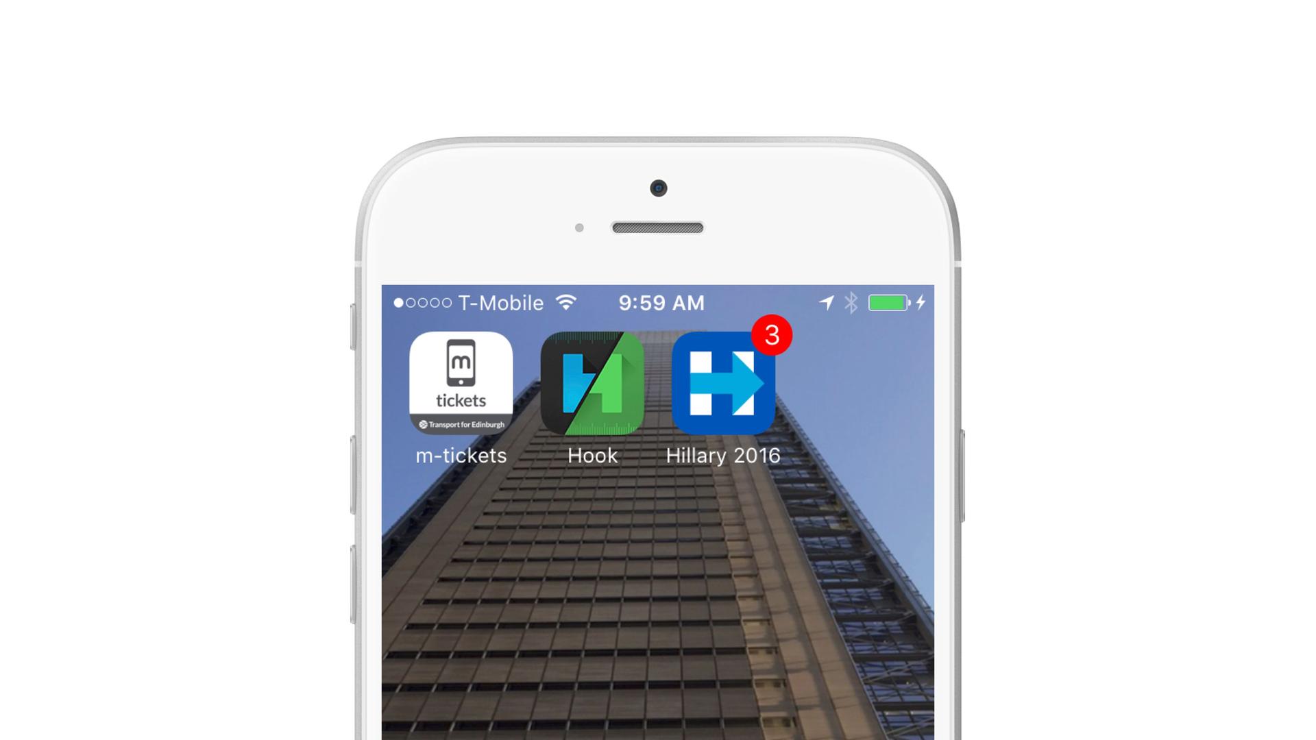
Last week, the campaign of Democratic nominee Hillary Clinton launched Hillary 2016, an iOS mobile app (an Android version is reportedly on the way) that is perhaps the most advanced effort yet to take advantage of mobile-powered relationship marketing in the context of a political campaign. And while most marketers are pretty unlikely to find themselves running communications for a presidential campaign, there’s a lot that brands can learn from the coordinated way that the app goes about encouraging users (voters? donors?) to engage more deeply and carry out desired actions.
6 things that Hillary 2016 does (that you should probably be doing, too)
While the Hillary 2016 app has a lot of features and sections and bells and whistles, these six techniques and features are particularly likely to be valuable in a mobile marketing context:
1. In-app user education efforts that continue past the first session
Onboarding new users is key if you want them to really engage with your app. By educating users about the value that your app can provide and how to take advantage of it right from the first session, you can provide your users with a better in-app experience and increase the odds that they deepen their engagement.
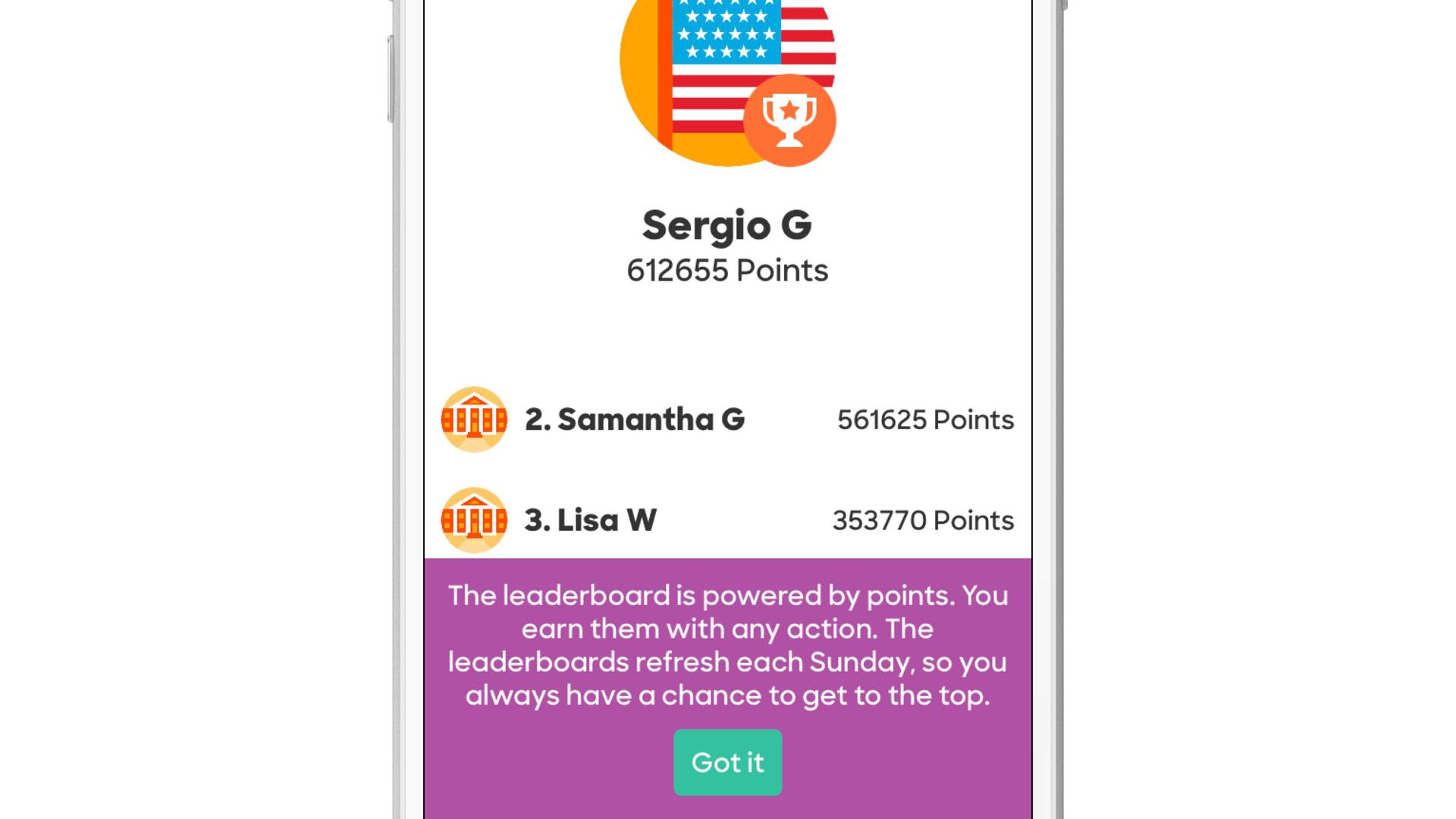
An in-app message continuing user education following onboarding
Hillary 2016 does that by taking advantage of in-app messages to walk new users through the app’s major functions—but it doesn’t stop there. Each time a user opens a new section of the app or begins to carry out a new action, they receive an additional in-app message that gives additional context or guidance, ensuring that users don’t get lost or bogged down while using the app.
2. Multichannel messaging that includes push, in-app messages, and a news feed
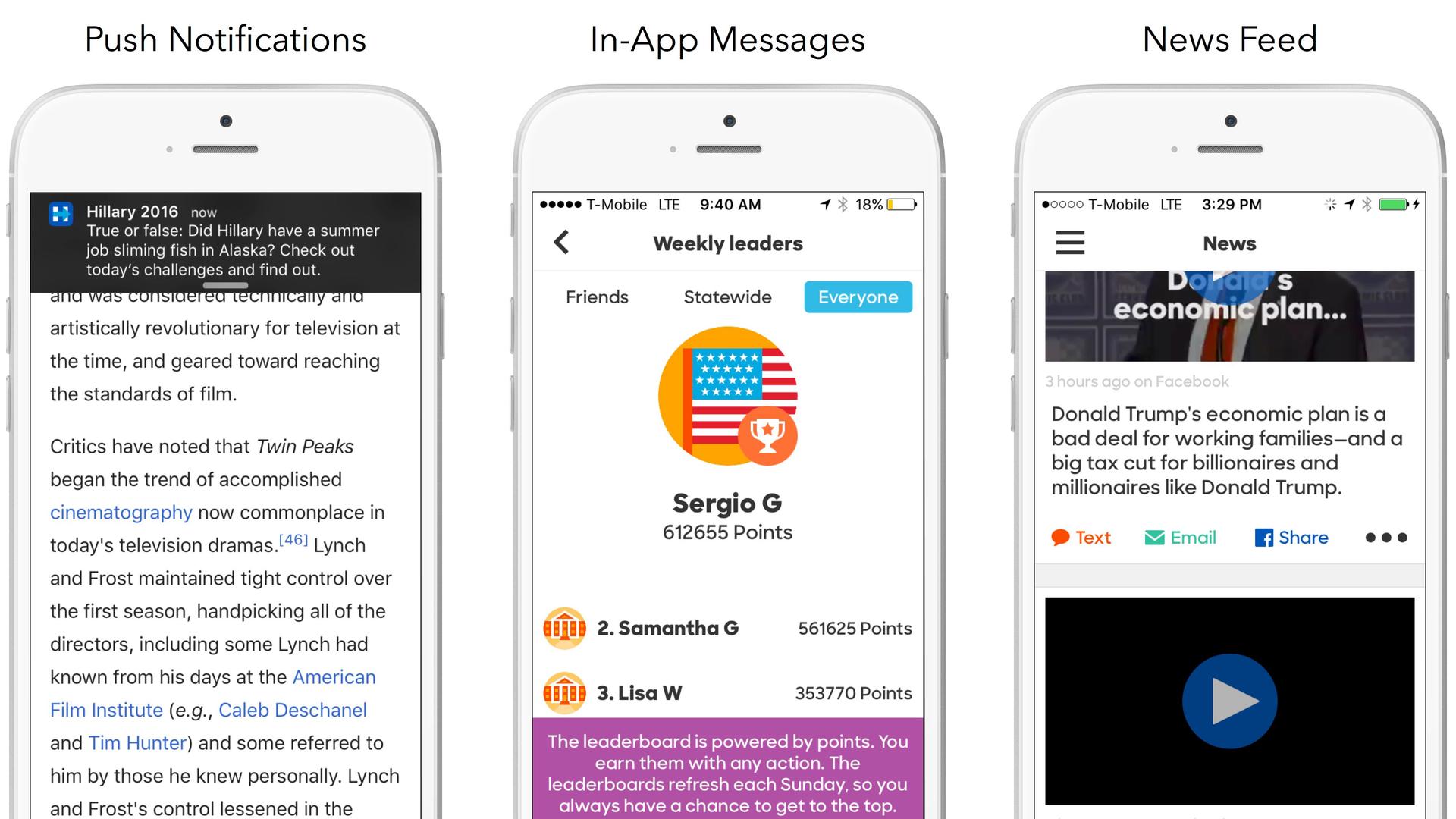
User messaging channels used by the Hillary 2016 app
When you’re looking to reach users effectively, you need a multichannel messaging strategy. By communicating in different channels in a coordinated way, you get more opportunities to connect with customers, more insight into which channels they prefer, and the ability to significantly boost user retention. And the Hillary 2016 app does an unusually robust job incorporating multiple outreach channels into its user messaging, with push notifications, in-app messages and a news feed all used to communicate effectively with the Hillary supporters in a seamless, comfortable way.
The Hillary 2016 app does an unusually robust job reaching users through multiple outreach channels.
3. Priming for app permissions
On iOS, you need customers to agree and opt in before you gain the ability to send them push notifications or access their contacts or other aspects of their mobile device. However, many people are resistant to these sorts of requests, with a full 60% of iOS users declining to enable push notifications. By priming for push, brands can sell their users on the benefits of enabling push while also reserving the ability to ask them to opt in later if they’re not sold the first time. Hillary 2016 takes this approach and extends it to a variety of other permissions. When a user is asked to grant access to their contacts or their location, for instance, they first receive an in-app message explaining why the app wants that access and how granting it will benefit the user—and only launches the iOS system opt-in prompt if the user has indicated they’re willing to grant the request.
4. Smart use of gamification to encourage deeper (and more regular) user engagement
When a user first opens Hillary 2016, they’re greeted by an interactive illustration of a campaign office, complete with fliers and plants that need watering. But if a user DOES water the plants, explore the office, begin checking out other parts of the app, they’re rewarded with stars, which can be spent on office furniture and other decor—allowing them to customize the look of the app—or on real-life swag like a Hillary Clinton autograph.
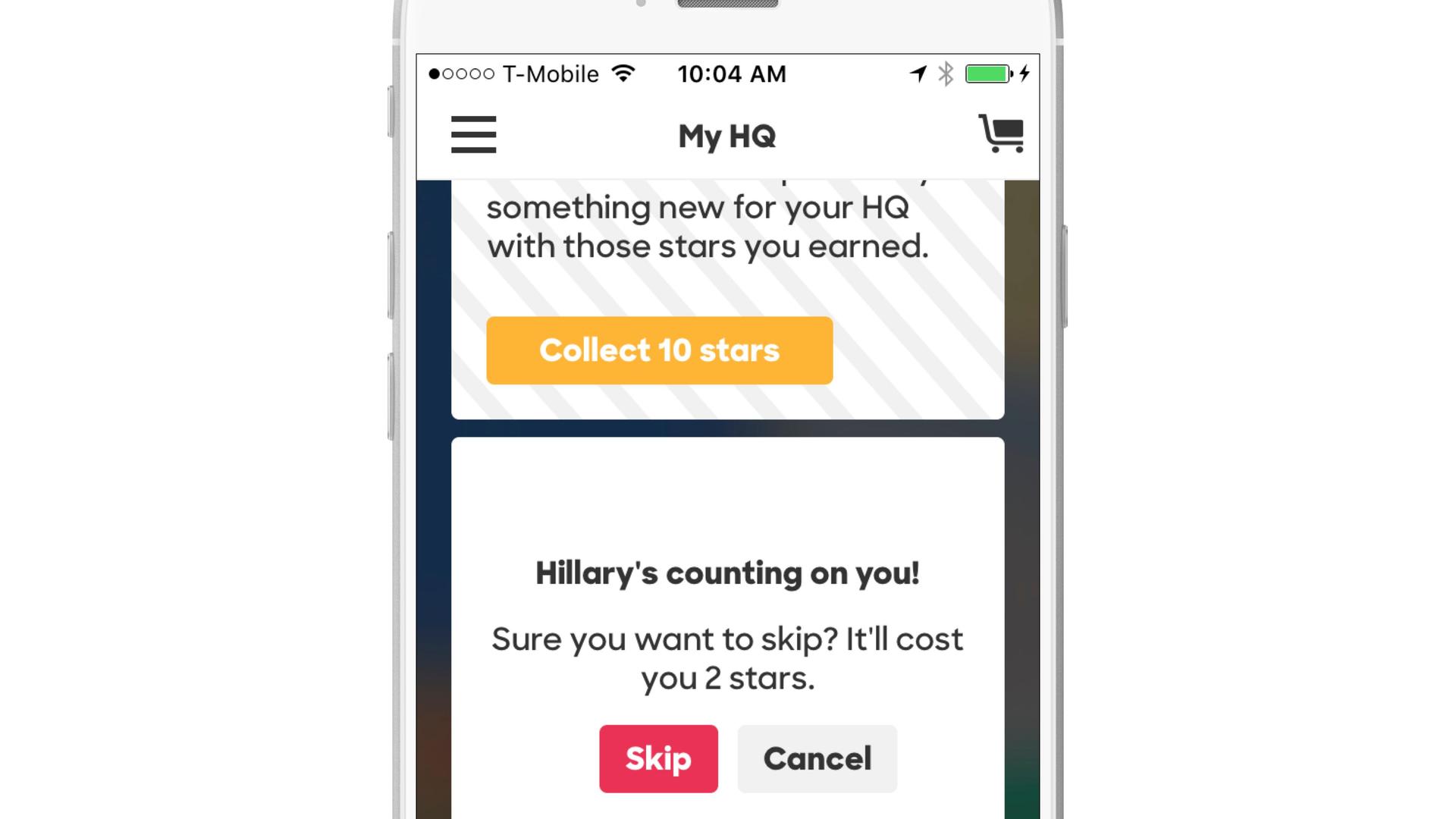
Gamification in the Hillary 2016 app
This kind of gamification creates a positive feedback loop that encourages more exploration and engagement with the app and, by extension, with the Clinton campaign as a whole, increasing the odds that they pay attention to its messaging and turn out in November. The same technique can work for brands by giving customers reasons to deepen their engagement and to return more consistently, increasing the chances that they’re retained over the long haul.
5. Messaging and topic preference centers
Adding a preference center within your app makes it easy for customers to let you know whether they’re interested in being reached through certain messaging channels and what topics they’re most interested in being contacted about, allowing users to self-personalize and making it more likely that they’re interested in (and engage with) the messages you send. In the Hillary 2016 app, users are given access to two preferences centers—one simple, and one rich.
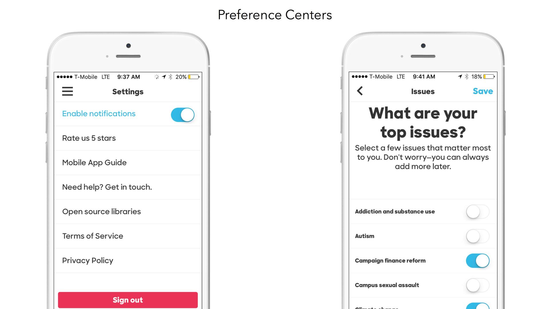
(l-r:) Hillary 2016’s simple and rich preference centers
The simple preference center allows users to easily grant or retract push notification permissions without having to go to their iOS device’s Settings, giving customers a sense of control over the push notifications they receive. The rich preference center allows users to highlight the issues that matter the most to them from a list of 32 possible ones, including “Disability rights,” “Racial justice,” and “Voting Rights.” That makes it possible for the Clinton campaign to to target future messages to users based on the topics they expressed interest in, making that outreach more valuable and increasing the chances that they engage with it.
6. Integration between the campaign’s app and website
When users open the Hillary 2016 app for the first time, they’re prompted to log in using Facebook or an email address, or to create a new account to use the app. By allowing users to easily connect their social or email account to the app, the Clinton campaign is able to gather useful voter data and, for individuals who have previously created an account on the Clinton campaign website, to connect their web and mobile profiles into a single, cohesive user profile.
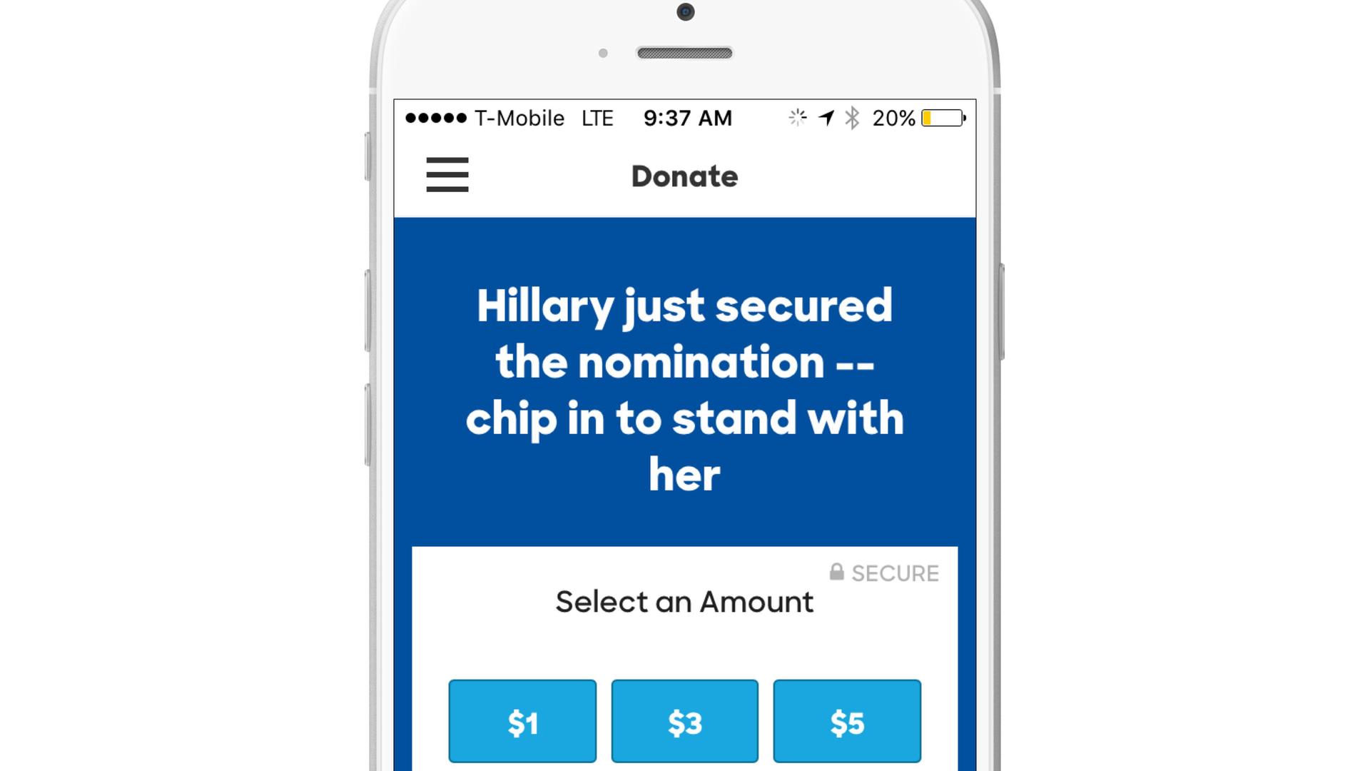
Hillary 2016’s in-app donation page
That means, for instance, that a user who has already donated money to the Clinton campaign can download the app, log in via Facebook, and then make another donation in as a little as three taps, all without having to re-type their mailing address or their credit card information. When you consider that, during a purchase flow on a mobile app, 25–60% of users are lost with each tap, this kind of integration significantly increases the likelihood that a given user makes a donation (or, in the case of a brand, makes an in-app purchase) while also providing a better, smoother user experience for each individual.
The Clinton campaign’s strong app/website integration makes donations easier—and more likely.
2 missed opportunities for the Hillary 2016 app
While the Hillary 2016 app doesn’t have any significant deficiencies when it comes to the in-app or user messaging experience it provides, there are two notable missed opportunities that the Clinton campaign could stand to address:
1. Lack of personalization
While the app does allow users to self-personalize via its preference centers and to adjust the look and feel of its home screen by decorating the app’s campaign office, the lack of message personalization is definitely felt. While the push notifications and in-app messages used to communicate with supporters are well-written and engaging, the lack of personalization in terms of topic and content makes them feel, well, impersonal.
More notably, the app’s news feed includes content in Spanish next to content in English, creating the strong possibility that a significant chunk of users will be unable to read some of the news feed cards, potentially creating an alienating experience. If the app used language-based personalization to automatically adjust messaging to match each user’s prefered language, the content could shine through more effectively. Ganar/ganar.
2. Lack of coordination between mobile messaging channels and email
While the mobile messages sent to Hillary 2016 users are appealing and well-timed, the campaign doesn’t seem to be operating its email in concert with those other channels. That’s currently creating an unideal experience where users who are engaging with push notifications and news feed cards and taking requested steps within the app are still being hit with a firehose of emails from the campaign highlighting the day’s news and asking for donations.
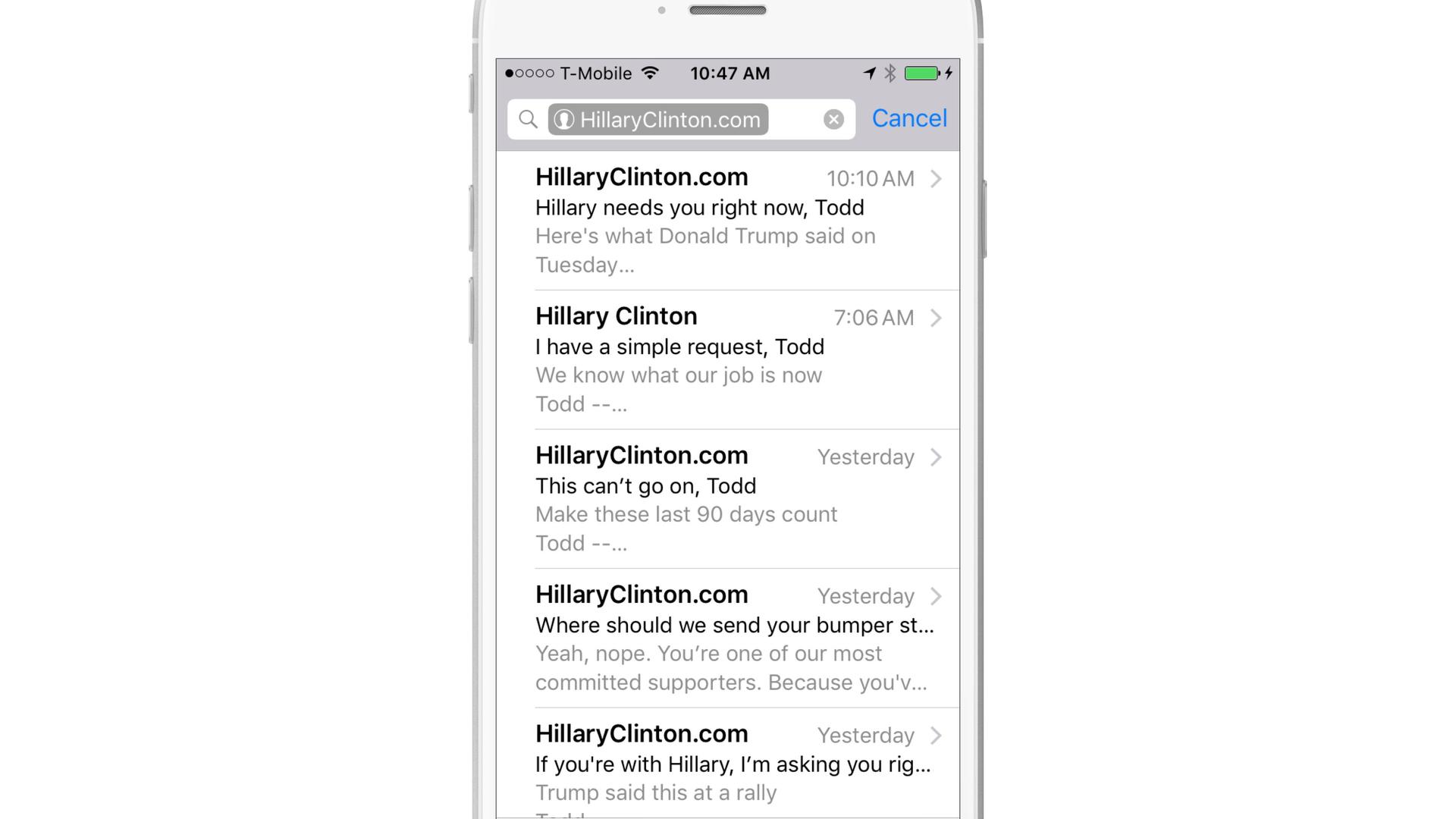
Emails received from the Clinton campaign during the first 24 hours of app usage
For a truly best-in-class user messaging experience, the campaign should be coordinating the messages that are sent to customers to ensure that each message is adding value and not urging recipients to take steps they’ve already taken, such as making a donation or reaching out to friends.
Final thoughts
The tools and strategies being used by the Clinton campaign to reach and engage their audience of supporters using the Hillary 2016 app are powerful, and they can work just as well for brands that are seeking to better reach, engage, and monetize customers. Not every one of these techniques and features is going to be a good fit for your brand, but the sort of thoughtful, comprehensive approach that the Clinton campaign has achieved here is something that all brands should be aiming for.
The Clinton campaign’s approach to relationship marketing is something all brands should aim for.
To get started, check out our overview of relationship marketing and our post on how to more effectively understand your customers by putting yourself in their shoes.
Related Tags
Releated Content
View the Blog
Shipping reinforcement learning that matters: Life as a Forward-Deployed Data Scientist at Braze

Fausto Costa
Integrated marketing strategy: How to align campaigns, messaging, and data across channels
Team Braze

Cross-channel marketing platform: How to choose the best solution for enterprise brands
