Worth A Thousand Words: A Masterclass in Cross-Channel Rich Content
Published on September 08, 2017/Last edited on September 08, 2017/4 min read


Todd Grennan
Content Production Principal, Content Marketing at BrazeDear reader: This blog post is vintage Appboy. We invite you to enjoy the wisdom of our former selves—and then for more information, check out our new Cross-Channel Engagement Difference Report.
When marketers think about their customer messaging, the focus tends to be on copy, which makes sense. In the early days of email marketing and mobile messaging, a lot of outreach channels weren’t well-positioned to do much more than deliver text-based communications, leading a lot of companies to get into the habit of putting copy at the center of their customer engagement efforts.
That’s not a problem in and of itself—after all, great copy can be powerful, persuasive, and highly impactful. But it’s not the only way for a brand to get its point across. And now that more and more messaging channels are supporting rich content, it’s now possible to center customer outreach campaigns around images, animated GIFs, videos, and more. To get a look at what’s possible, let’s check in with iconic retailer Urban Outfitters, which has this sort of thing down to a science:
The campaign (and what makes it special)
While Urban Outfitters is perhaps best known for its clothing, the brand sells a wide array of lifestyle-focused items, from books to housewares. And when the time came to highlight a major promotion on its furniture offerings, Urban Outfitters created a cross-channel promotional campaign that put the visual side of their brand front and center. Here’s what made it special:
1. Rich push notifications that go the extra mile
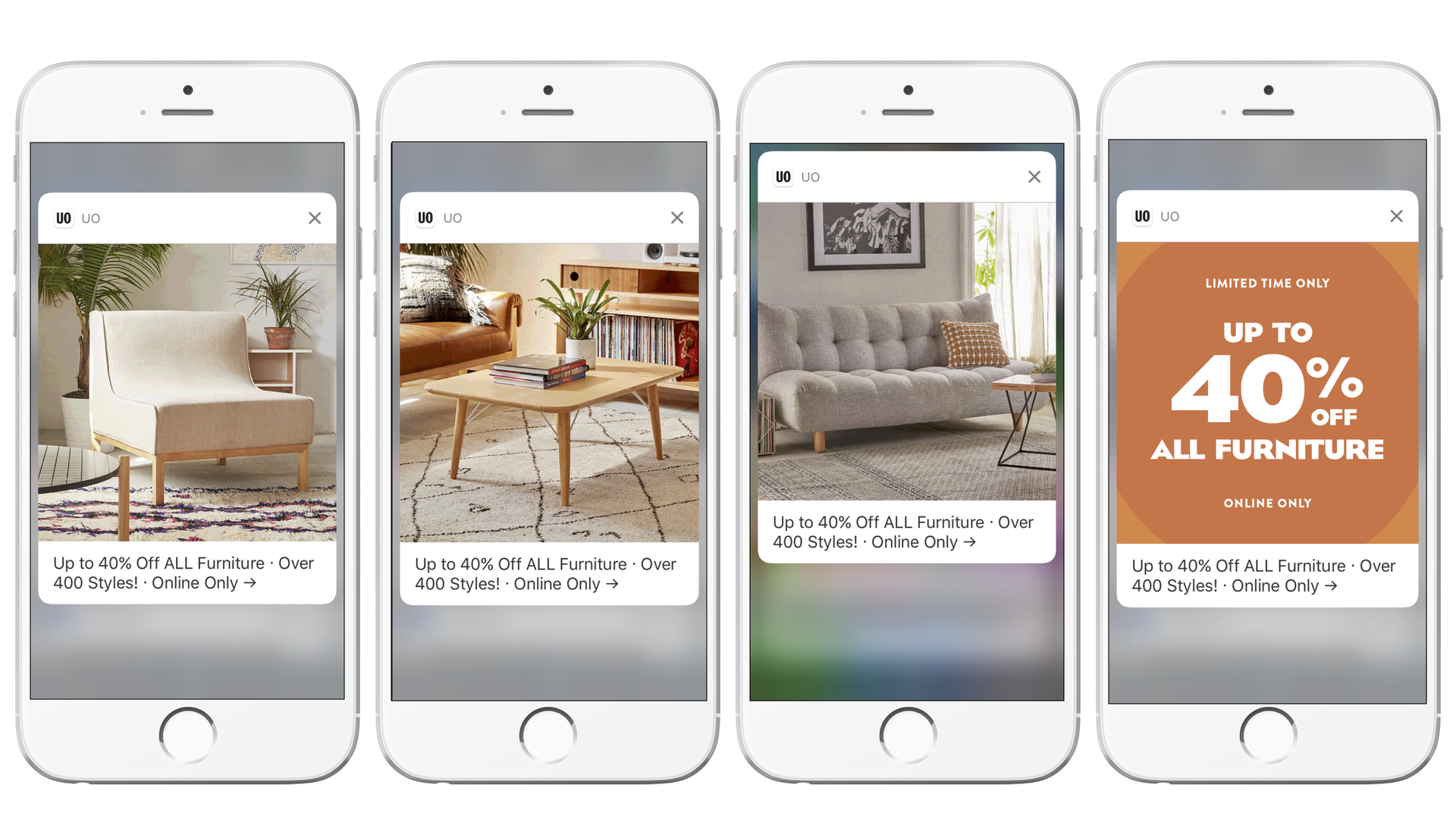
While Urban Outfitters is no stranger to rich push notifications, this campaign outdid itself. Instead of using a single memorable image to capture recipients’ attention, the brand included an eye-catching animated GIF that cycled through some of the sale’s most appealing items, using those pictures to sell customers on the promotion’s offerings. Plus, the message underlined the major discounts on offer by highlighting them both in the message copy and the GIF itself. That’s memorable—and hard to ignore.
2. Coordinated emails that leverage the power of animated GIFs
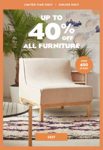
While push is an effective way to grab customers’ attention for time-sensitive promotions and other urgent communications, brands see stronger results if they combine push outreach with other messaging channels. To make the most of their promotional efforts, Urban Outfitters paired their rich push messages with a coordinated email-send that featured its own visually-striking animated GIF, ensuring that their target audience received a rich content-focused messaging experience no matter what channel they engaged with.
3. Smart deep linking that gets the customer where they need to be
Too many brands go to the effort of creating smart, thoughtful messages and then see that work go to waste. Why? Because when the people receiving that outreach click an email link or tap a push, they find themselves dumped unceremoniously on the main page of the brand’s app or website, instead of being brought to somewhere relevant to the message itself.
Urban Outfitters knows better. By taking advantage of deep linking, the brand ensured that customers engaging with their campaign were brought directly to the page on their website focused on the furniture sale in question, ensuring a smooth, seamless customer experience and reducing the chances that interested customers left without browsing the available items.
4. Using in-browser messages to reach customers who aren’t sold on the initial promotion
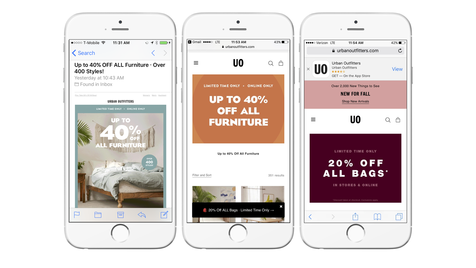
What about the customers who have second thoughts when they view Urban Outfitters’ furniture? Maybe they can’t find a piece that speaks to them; maybe they have second thoughts about a big-ticket purchase. That’s too bad—but it doesn’t mean that they aren’t interested in buying SOMETHING.
To reach these wavering shoppers, Urban Outfitters took advantage of an unobtrusive in-browser message to highlight another concurrent sale on bags. Customers who were sold on purchasing furniture could easily ignore the outreach—but for everyone else, the in-browser message’s simple, compelling copy and smart emoji use nudged them to browse a little longer, increasing the odds that they ended up making a purchase.
Final thoughts
It’s no surprise to see this kind of sophisticated, stylish outreach from Urban Outfitters—the brand has long been an innovator and early adopter of emerging marketing tools and tactics, paving the way for other brands and building strong relationships with their customers. This forward-looking approach has also paid big dividends for the brand, including:
- Boosting messaging rates by more than 100% using send-time optimization
- Increasing revenue per customer by 146% using dynamic audience filters powered by PlaceIQ
To learn more, check out our blog post about Urban Outfitters and their forward-looking approach to marketing.
