
Mobile app retention: How to measure, benchmark, and improve It
Published on June 18, 2026/Last edited on June 18, 2026/17 min read

Team Braze
Every app has a version of the same problem. Users arrive, often in large numbers, and most of them leave before they've formed any kind of habit. The ones who stay are disproportionately valuable. They engage more, spend more, and represent a fraction of the cost of acquiring someone new.
Understanding retention means understanding when that relationship starts to break down, which data signals show it coming, and what the evidence says about the moments where early intervention makes the biggest difference.
Read on to understand what the data is telling you, and what to do about it.
TL;DR
- Most apps lose more than 90% of users before Day 30, making retention a higher commercial priority than continued acquisition spend alone
- Day 1, Day 3, Day 7, Day 30, and Day 90 each measure a different stage of the user relationship, and benchmarks only make sense when read against category-specific data
- The most common causes of churn are poor onboarding, notification fatigue, and no perceived value, all of which show up in the data before the uninstall happens
- Cross-channel engagement, behavioral personalization, and AI decisioning are the strategies with the most consistent and measurable impact on retention rates
What is mobile app retention?
Mobile app retention is the measure of how many users continue to engage with an app over time after their initial download or first session. Expressed as a percentage, the retention rate tracks whether users return on Day 1, Day 3, Day 7, Day 30, and beyond. It's one of the most important metrics for evaluating an app's long-term value, user experience quality, and overall business health.
Acquisition costs have been rising for years, driven by privacy changes, crowded ad markets, and more apps competing for the same installs. Across most app categories, Day 30 retention rates sit between 1.2% and 5%, which means the vast majority of acquired users don't last a month. Pouring more into acquisition while users churn at that rate doesn't build customer lifetime value, and so retention becomes vitally important in turning acquisition spend into actual return.
The retention curve tells the same story for most apps, and is why mobile customer engagement across the full lifecycle matters so much. A steep and early drop-off sees the majority of users gone within the first few days, before they've had any chance to form a habit. After that cliff, the curve flattens. Users who make it past the first week are far more likely to still be active at Day 30.
How to calculate mobile app retention rate
To calculate mobile app retention rate, divide the number of users still active at the end of a given period by the number who were active at the start, then multiply by 100.
Retention rate = (users active at end of period ÷ users at start of period) × 100
If 1,000 users installed your app in January and 220 of them were still active 30 days later, your Day 30 retention rate is 22%. Before that number means anything, your team needs a shared definition of what "active" means for your retention marketing plans, whether that's opening the app, completing a specific action, or something product-specific. Without that agreement, two people can calculate the same metric and get completely different numbers.
What does each timeframe tell you?
Each timeframe measures a different stage of the user relationship, and what counts as a healthy number varies at each point.
How does cohort analysis change what the numbers mean?
Cohort analysis groups users by the date they first installed the app and tracks each group's retention curve independently over time. Without it, your retention rate is a blended average of users at completely different stages of their journey.
A strong cohort from six months ago can mask a deteriorating experience for users who installed last month. Cohort analysis separates those two stories so you can see which one is actually happening.
It also helps you account for external factors that affect cohort quality. If a paid campaign or promotional event drove a spike in installs during a specific period, the resulting cohort may behave differently from organic ones. Those users often arrive with different intent or expectations, and their retention curve reflects that rather than the product itself. Failing to segment for this can make a campaign cohort look weaker or stronger than it actually is.
What's the difference between retention rate and churn rate?
Retention rate and churn rate are the same number described from opposite directions. If your 30-day retention rate is 22%, your churn rate is 78%.
Churn rate = 100 − retention rate
When should you use rolling vs. classic retention?
These two methods measure different things, and mixing them up produces numbers that look better or worse than they actually are.
Classic retention asks whether a user opened the app on a specific day. For example, a classic Day 7 calculation counts only users who returned on day 7, not day 6 or day 8. It's strict, and the numbers reflect that.
Rolling retention asks whether a user opened the app on or after a specific day. For example, rolling Day 7 counts anyone who returned from day 7 onward, which will always produce higher figures than classic for the same dataset.
Classic is the better fit for apps where regular, habitual use is the point: social platforms, fitness apps, daily tools. Rolling suits apps people use less frequently by design, like banking, travel, or seasonal utilities, where what matters is whether users come back at all rather than whether they come back on a schedule.
Report both if you can. At minimum, be consistent, and make sure anyone reading your retention data knows which method produced it.
Mobile app retention rate benchmarks
Day 30 retention rates vary significantly by category and by platform. News sits well above every other category—a reflection of its small, intentional user base rather than typical retention dynamics.
The table above covers both iOS and Android, sourced from AppsFlyer via Business of Apps.
What do these benchmarks actually mean?
A benchmark only tells you something useful in context. The same Day 30 rate can reflect strong performance or a problem depending on two things: how the app is monetized and how often users are naturally expected to return.
Subscription apps consistently outperform ad-supported equivalents because paying users have made a financial commitment that changes how they engage. Blending free and paid tier data produces a number that doesn't honestly describe either group. Usage frequency shapes the picture just as much. A banking app opened twice a month, consistently, for 90 days is retained. A fitness app opened every day in January and twice in March is churn, even if the 30-day number looked fine. Utility apps and frequency-dependent apps operate on different cycles, and their benchmarks should be read accordingly.
Cross-channel engagement consistently moves these numbers. According to the 2023 Global Customer Engagement Review, brands using cross-channel strategies drove 55% higher 90-day retention than those relying on a single channel.
Why users leave (and what the data tells you)
There are multiple reasons that stop people from using an app. While these reasons can look different across categories, the underlying issues are usually the same.
- Poor onboarding. Users who don't find value in their first session rarely come back. If the app doesn't deliver a quick win early, the default is to move on.
- Irrelevant notifications. Messages that don't match where a user is in their journey feel intrusive rather than helpful, and erode trust quickly.
- Performance issues. An app that crashes or loads slowly gives users a concrete reason to leave, even when the underlying product is good.
- No perceived value. Once a user stops seeing why the app is useful to them, the relationship is effectively over. This can happen gradually and is often invisible until the uninstall.
- Notification fatigue. When users start ignoring notifications rather than engaging with them, engagement is already in decline. Volume can be as damaging as irrelevance.
The critical windows: first session, first 72 hours, first 30 days
Each window carries a different churn risk and calls for a different re-engagement messaging strategy.
The first session sets Day 1 retention. A user who opens the app, gets confused, and closes it has little reason to return. That first impression is hard to undo, which makes onboarding the highest-impact investment in early retention.
The first 72 hours are the steepest part of the drop-off curve, and session frequency here is the clearest predictor of whether someone becomes a retained user. Triggered messaging and adaptive walkthroughs can support engagement without overwhelming someone still deciding. Permission priming belongs here too, giving users a reason to opt in before the system prompt appears.
By Day 30, users who stayed have built some kind of habit, and the priority is deepening it with things like feature discovery, recognising progress, and content that keeps pace with where they are. An at-risk signal at this stage might look like a user who opened daily for three weeks and then went silent for 10 days, not a new install that dropped off in the first few days. A lapsed habit needs different messaging than a failed first impression.
How to diagnose why users are leaving
To diagnose why users are leaving, you need to look at the metrics and signals that tell you what happened up to the exit point.
- Funnel analysis shows where users stop. If most new users never complete the first key action, start with onboarding. If they get through onboarding but stall at feature adoption, the issue is perceived value, not friction.
- Cohort curves group users by install date and track retention independently for each group. A cohort that retained better after a product change is a genuine signal. One that dropped faster tells you something went wrong. Perhaps a change in messaging, a feature that disappeared, or a bug that slipped through.
- Session frequency decay is the early warning system. When a user's session intervals start stretching, engagement is already declining, usually well before the uninstall. Catching that pattern within a 14-day window gives teams enough lead time to act before the user has made a firm decision.
Strategies to improve mobile app retention
The strategies below each target a different stage of the retention lifecycle, from the first session to recovering users who have drifted. No single one is sufficient on its own.
1. Optimize onboarding for the first session
Getting users to a clear moment of value in the first session is the highest-impact onboarding goal. Users who reach it are significantly more likely to return.
A well-designed onboarding flow uses progressive disclosure—revealing features gradually as users need them rather than presenting everything at once. Welcome messaging orients without overloading, permission priming makes the case for notifications before the system prompt appears, and in-app walkthroughs focus on one action at a time.
2. Build cross-channel engagement across the lifecycle
A single channel will rarely sustain retention across the full lifecycle. According to the 2023 Global Customer Engagement Review, messaging users across email, mobile push, in-app messaging, and SMS can result in a 2X lift in retention over six months. Each channel serves a different moment: push for timely nudges, email for deeper post-session content, in-app for meeting users where they already are. Coordinated through a single retention journey, they create a consistent relationship at every touchpoint.
Without frequency capping, a user can receive push, email, and in-app in rapid succession, which drives churn up. Each channel should have a distinct role.
3. Personalize with behavioral data
Retention improves when content is dynamic—adjusting based on what someone actually does in your app: their in-app actions, session patterns, purchase history, and stated preferences. Behavioral segmentation makes this practical at scale, grouping users by shared behaviors so each message is relevant to where they are in their journey.
Power users, casual users, and at-risk users all need different things. Identifying these groups early and messaging them distinctly is where Day 30 retention gains are made.
4. Deploy persistent in-app content
Content Cards deliver personalized content inside the app, available whenever the user opens it without interrupting what they came to do. Unlike in-app messages, Content Cards persist between sessions—they're there when the user returns, not just when they first open.
News feeds, personalized recommendations, feature announcements, and promotional offers can all be delivered this way. Content updates without an app release, which shortens iteration cycles and reduces developer overhead. In-app messaging delivered this way becomes part of the product experience.
5. Build re-engagement campaigns for lapsing users
Not every lapsing user has decided to leave. Between inactivity and full churn, well-timed re-engagement does its best work.
A user inactive for three days gets a gentle nudge; at seven days, the message becomes more direct with a stronger incentive; at 14 days, the offer escalates further. Win-back sequences across channels adapt based on whether the user responded to earlier messages. Deep linking back to the specific area of the app most relevant to that user removes friction from the return path.
Specificity is what makes re-engagement work. A message that reflects what the user was doing last, or highlights something they haven't seen, gives them a concrete reason to return.
6. Use AI decisioning to optimize retention at scale
AI decisioning determines the optimal channel, timing, content, and frequency for each user based on their actual engagement history.
Rule-based campaigns run the same conditions for every user regardless of how differently they respond. BrazeAI Decisioning Studio replaces static rules with reinforcement learning: send-time optimization, channel selection, and message personalization all adjust based on real outcomes and improve as the system learns. The larger the user base, the more that individual-level optimization compounds.
Mobile app retention strategies in action
The strategies in the previous section produce real results. These two examples, one from employee wellbeing and one from mobile gaming, show what behavioral messaging and cross-channel engagement look like when applied to actual retention problems.
The care that keeps: Sonder's 43% retention rise through smarter onboarding
Sonder is an Australian employee care platform founded in 2016 that helps organizations support the health, safety, and wellbeing of their people. Members access self-care tools, 24/7 registered health professionals, and real-time safety information through a mobile app, operating across Australia, New Zealand, and the United Kingdom.
The challenge
Sonder had clear ideas about how personalized, timely messaging could improve the member experience. The platform was getting in the way. Separate systems for different channels meant disjointed communications, slow campaign execution, and a team that couldn't act on member data quickly enough for the messaging to feel relevant.
The strategy
With Braze, Sonder brought all channels under one platform and built engagement flows around member behavior. For new members, they created an automated onboarding sequence: an initial email series followed by a targeted SMS to anyone who had viewed an email but not yet completed registration. Each step responded to what the member had already done, moving at the member's pace.
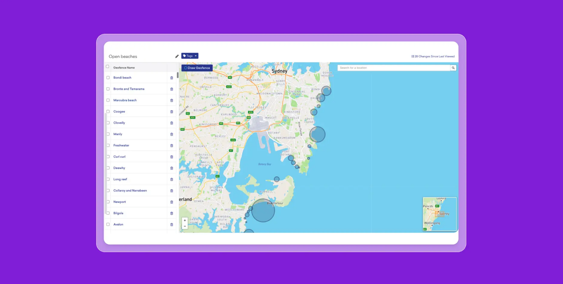
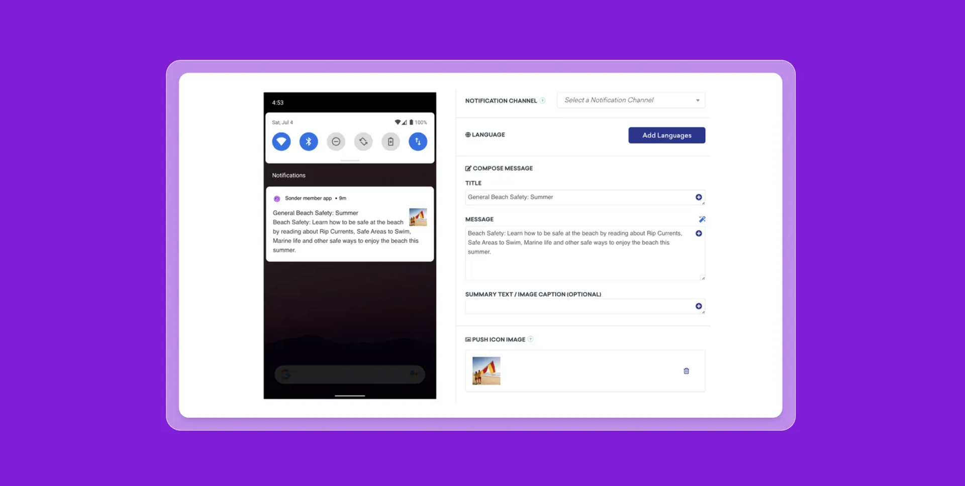
They also used geofencing to trigger push notifications for members visiting beaches in Australia, delivering real-time safety alerts, local beach conditions, and emergency contacts. Content was built in Sonder's CMS and deployed through Braze Catalogs for personalization at scale.
The wins
- 50% increase in app activations and registrations
- 43% increase in member retention
- 22% increase in Digital Product Usage (DPU) as of FY24
Second Dinner plays a strong hand: 96% player awareness from inside the app
Second Dinner is an independent game studio founded in 2018, best known for MARVEL SNAP, a fast-paced collectible card game featuring Marvel Universe characters. Regularly updating the game with new content, events, and community features is central to how the studio keeps players engaged beyond the initial launch.
The challenge
After the launch buzz settled, Second Dinner needed a way to sustain player engagement without paying to reach people already in the game. The team had been weighing YouTube boosts and paid social placements, but they had players inside the app with no reliable way to reach them without interrupting gameplay or committing to a full development cycle every time something new went live.
The strategy
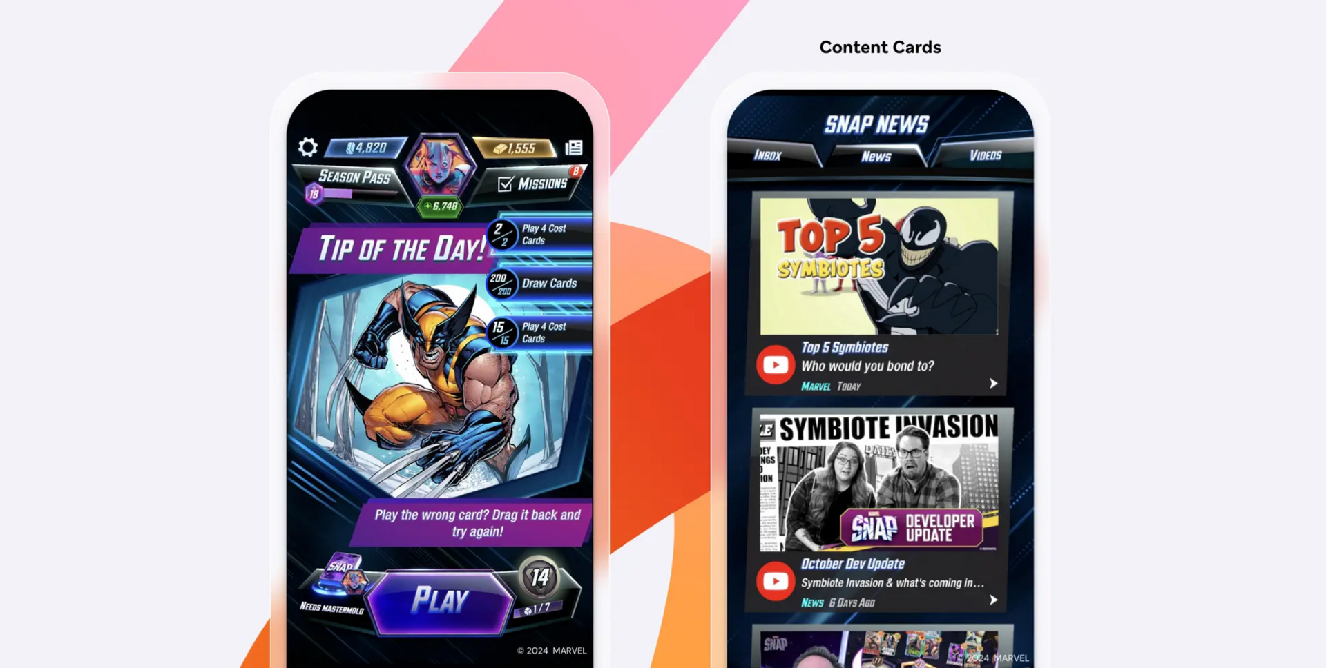
Second Dinner used Braze Content Cards to build a persistent, non-interruptive in-app content layer. Cards appeared naturally within the game interface, delivering news, creator spotlights, event announcements, and campaign updates as part of the experience. Because Content Cards don't require code changes or app store updates, the team could push and iterate on content the same day without developer involvement.
Player journeys were built in Braze Canvas, segmented by user attributes and behavioral data, so each player encountered content that reflected where they were in their MARVEL SNAP experience. The team analyzed message performance after each campaign and used it to shape the next one.
The wins
- 96% of engaged players identified Content Cards as their first point of awareness for new campaigns
- 86% of traffic to the campaign voting page was driven by Content Cards
Measuring what matters: key retention metrics
Six metrics, used together, give you a clear picture of how well your app is holding onto users and what that's worth commercially.
Retention rate by cohort and time period
Cohort-based retention rate groups users by when they first installed the app and tracks each group's retention curve independently. This is more useful than a blended average because it shows whether product changes or campaigns are actually moving the needle for newer users.
A cohort that retains better at Day 30 than the one from three months prior is a genuine signal of improvement. One that performs worse tells you the same in reverse, even when overall numbers look flat.
Session frequency and session length
Session frequency measures how often users open the app; session length measures how long they stay. Together they tell you the nature and depth of engagement across your user base.
What those numbers should look like depends on the app. A banking app with short, daily sessions, for example, reflects healthy habitual use, while a gaming app with less frequent but longer sessions suggests a different kind of value. What matters is whether the pattern fits how your app is meant to be used, and whether it's trending the right way.
Stickiness ratio (DAU/MAU)
The stickiness ratio divides daily active users by monthly active users. A ratio of 20%, for example, means one in five monthly users opens the app on any given day.
Social apps tend to run high; utility and transactional apps typically run lower, but can still reflect healthy engagement if sessions are intentional. Tracking the ratio over time shows whether habits are forming or fading.
Uninstall rate and uninstall tracking
Uninstall rate measures the percentage of users who remove an app within a given period. Tracking when uninstalls happen is usually more actionable than the rate alone.
A spike on Day 2, for example, points to a broken onboarding experience. A cluster around Day 14 might suggest users hit a point where the app stopped delivering clear value, or where notification frequency tipped into friction. Mapping uninstall timing against your retention curve shows not just that users left, but approximately when they decided to.
Customer lifetime value (CLV)
Customer lifetime value is the total revenue attributed to a user across their entire relationship with the app. It is the commercial output of every retention decision your team makes.
A user retained for six months who makes repeat purchases or holds an active subscription, for example, generates substantially more revenue than one who churns after the first week. Even modest improvements in Day 30 retention compound into real CLV growth at scale.
Attribution: connecting retention activity to revenue
Attribution in retention marketing means connecting specific campaigns, channels, or in-app behaviors to measurable outcomes: revenue, repeat sessions, and subscription upgrades.
It's the step that often gets skipped. Teams run a re-engagement campaign, watch active users tick up, then move on without confirming whether those users stayed or spent. Clean attribution means defining what a retention win looks like: a second purchase, a 30-day streak, a subscription renewal, and using journey orchestration to build and trace those sequences. Without that connection, repeating what actually worked becomes guesswork.