Exploring iOS and Android Push Differences: What Marketers Need to Know
Published on June 23, 2020/Last edited on June 23, 2020/10 min read

Mariam Kazmi
Solutions Consultant, BrazePush is powerful. In the 11 years since Apple first introduced APNs (Apple Push Notification System) for iOS apps, we’ve seen this mobile messaging channel grow from a one-note pipe for urgent notifications into a rich, flexible way for brands to speak to their customers in the moment. And when they’re used effectively, push notifications can be a powerful tool for marketers—Braze research has found that users who receive push notifications see 191% higher engagement than users who receive no messages at all.
But not all push notifications are created equally. When you’re determining the role that push plays in your larger marketing strategy, it’s important to understand the structural, visual, and experiential differences that exist between the two dominant mobile operating systems: Google’s Android and Apple’s iOS. To help out, let’s take a look at the key differences that marketers need to know to make the most of push notifications.
Android vs. iOS: Different Operating Systems, Different User Types
First things first: No messaging channel exists in a vacuum. Before you can effectively target your user base with push notifications, you have to understand them—their behaviors, their preferences, even their mindset. Studies have suggested that iPhone users tend to be both more affluent and more extroverted than Android users, as well as more likely to view their smartphones as status objects, rather than practical tools. These differences won’t affect every push campaign, but they’re something to keep in mind as your tailor and segment your messaging in this key channel.
These general trends reflect some key differences in engagement behavior. According to a study of 31 million transactions conducted by Wolfgang Digital, the average Android user spends $11.54 per transaction, compared to $32.94 for iPhone users. With iPhone users spending 185% more per transaction than an Android user, brands may find that—for instance—targeting iOS users for promotional messages could lead to higher revenue.
Another key user difference between the platforms is how prompt users are about updating their operating systems. The majority of iPhone users tend to use the most up-to-date version of iOS, with 77% of iOS users on iOS 13 (the most current version), 17% on iOS 12, and only 6% of users on earlier iOS versions as of January 2020. In contrast, the only 22.6% of Android users were even on Android Pie (the second-most recent version) as of October 2019. This key difference reflects Apple’s more aggressive pushing of OS updates and the fact that iOS is only used on devices manufactured by the company, which is quite different from the diverse vendor base for Android (including Samsung, LG, One Plus, Moto, Google and others). Because richer push notification experiences have often been introduced in OS updates for iOS and Android, Android’s slower adoption among its users means that marketers interested in leveraging the latest push capabilities may have an easier time doing so with iOS push.
Android vs. iOS: How They Handle Push Opt-Ins
While push notifications are supported on both Android and iOS, there are some notable differences in the way these different operating systems support and display them, leading to corresponding differences in how users interact with them. One of the biggest? Whether or not users opt in to receive push notifications.
On Android devices, when a user downloads an app, they’re informed that the app will be given certain permissions, including the ability to send push notifications. If users don’t want to receive notifications for any reason, they have the ability to opt out, but doing so is a manual process, limiting the number of users who actually take that step.The result? Android apps tend to have a larger than average proportion of push-enabled users who can be reached effectively via this channel...but because even users who aren’t interested in getting push still often receive them, sending irrelevant or too-frequent messages can nudge customers to tune out of messages, or even uninstall apps completely. By the same token, Android’s default opt-in approach could potentially lead push notifications to get more easily buried if users are automatically enabling push for all the apps they download, making push timing a key consideration to drive stronger engagement.
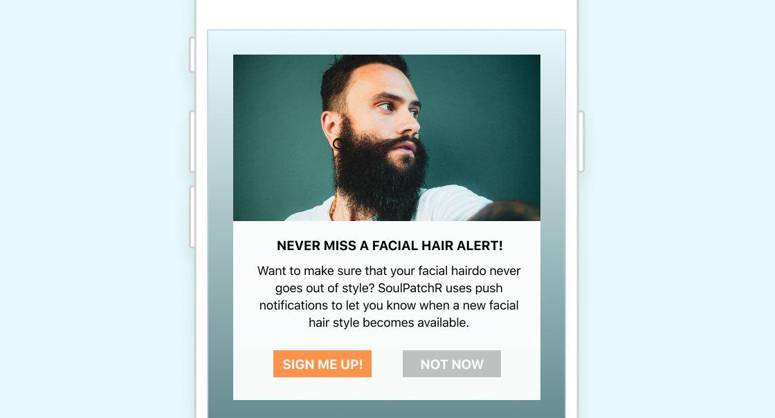
iOS is a different story. Because Apple traditionally required users to affirmatively opt in before they can be sent any push notifications, many consumers with iOS devices don’t have push enabled, complicating efforts to reach them outside the app. As a result of this approach, there is more pressure for brands to focus on properly “priming for push” to sell their customers on the benefits of push—for instance, by using an in-app message to explain the benefits of opting in before triggering that system prompt that actually allows users to opt in or out. Users benefit from the increased control that this provides and brands get a clear signal about which customers are interested in being messaged via this channel.
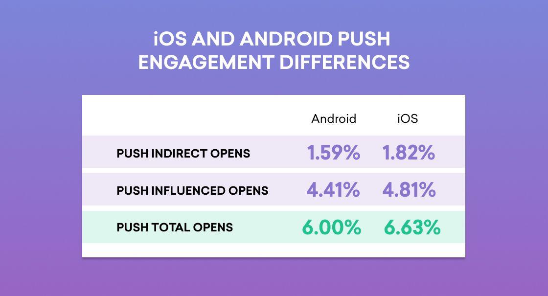
This differentiation serves as the foundation of how each group of users engaged with push notifications. For instance, iOS users often open notifications faster than Android users and with potentially higher purchasing inclinations. (For the latest on how iOS and Android push are performing, check out our Braze Benchmarks tool.)
Android vs. iOS: Different Push Notification User Engagement Patterns
The differences between push on Android and iOS don’t begin and end with push permissioning—these are genuinely different platforms, and those differences play out across the push experience. In particular, Android is built to make push notifications more accessible to users and to keep them accessible longer than on iOS.
When a user receives a push notification on iOS while their phone isn’t being used, they can see it on their lock screen, but when they unlock their device, the message vanishes and is visible only if the user takes an additional step and visits their notification center. On Android, however, push notifications remain present when users unlock their device and users have to take action to remove them from the screen; that would seem to increase the opportunities for users to notice and engage with the notifications sent in this channel.
This Android tendency to make notifications more accessible for longer periods of time also shows up in connection with each operating system’s device control centers: Android displays notifications there, while iOS doesn’t. That being said, user experience isn’t prophecy—it’s quite possible for Android users to have more opportunities to open a push and still do so less than iOS users.
Similarly, there’s a different user experience when push notifications are sent to iOS and Android users who are active on their devices. On both Android and iOS, users are given the ability to dismiss the message, open the underlying app, view message details, or respond to the notification when feasible (for instance, if the push is associated with a OTT messaging app like Facebook Messenger). However, Android also provides users with the ability to “snooze” a notification for a period of time that is picked from a user set default, allowing users to re-engage later with push that arrives at inconvenient times.
As a marketer, it’s important to think through these user experience differentiators and assess how they may impact the way your notifications are seen or experienced. For instance, when you’re sending real-time push notifications, or time-sensitive material, what will that experience be like for users with iPhones, as opposed to those with Android devices? (Does using send-time optimization tools like Intelligent Timing become more important for iOS, since it lacks Android’s push snoozing option, for instance?) Additionally, these differences mean that it can be worthwhile to look at a OS-specific view of how your push campaigns are performing, since Android vs. iOS differences in user behavior can lead to significant deltas between these two types of push for some metrics.
Android vs. iOS: The Rich Push Difference
While push notifications have long been seen as synonymous with urgent messaging (which, to be fair, they do effectively support), the reality is that this channel is more flexible and more visual than most people give it credit for. Push didn’t initially support rich content types, such as images, but over the past five years, we’ve seen a swift evolution that’s done a lot to broaden the uses and experiences associated with this channel. But while both Apple and Android devices both support rich notifications, there are notable differences between the support each one offers.
Android got to rich push first by introducing support for images and sounds in 2013—but the story stops there, with no additional rich content support added in the years since. Apple, on the other hand, was later to the party, not adding rich notification support until the launch of iOS 10 in 2016. But when it jumped on the bandwagon, it was in a big way: iOS 10 allowed brands to send users push notifications that include images, animated GIFs, sounds, video, and even app-like in-message experiences, like monitoring the location of an arriving vehicle within a rich push from a ridesharing app.
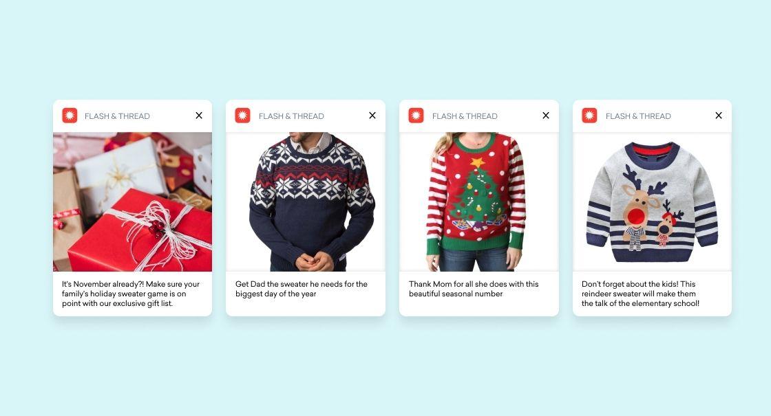
The inclusion of high-resolution images, along with customized call-to-action buttons are the hallmark of today’s best push. Rich push can have a big impact on both Android and iOS platforms—adding an image to a message has been shown to increase conversions by 57%— but being thoughtful about how you deploy rich push to different audiences is key to getting the full benefit of the powerful tool.
Rich notifications provide more information about the products while making it possible for recipients to more easily judge the colors, contours and the features of products being highlighted. However, brands looking to highlight a wider variety of products via rich push run the risk of sending too many notifications, leading recipients to disengage. One smart way to avoid this outcome is by leveraging Push Stories, which are available on both Android and iOS devices. This tool, also known as carousel push, allows marketers to include a collection of scrollable images within a single message, allowing—for instance—a retail brand to show off five different styles of pants that are currently on sale.
Final Thoughts
The truth is, one size doesn’t fit all. Your iOS users may respond more actively to your messages because they affirmatively chose to receive them, making it a smart move to use all the push tools at your disposal, from rich push to send-time optimization. By the same token, you may find that your Android users engage more passively with their messages, requiring a more experimental, long-tail approach to identify what will turn them from push readers to push openers over time.
Be thoughtful about how these different operating systems impact the experiences that your customers have when receiving push. Keep an eye on the results you’re seeing on each platform. Try different approaches and test the impact. And don’t lose sight of the differences in customer experience on both Android and iOS. Do all that, and you’re well-positioned to make push a powerful part of your messaging to Apple obsessives and Android fans alike.
Looking for more information on all things push? Check out our exclusive push notification guide to dig even deeper.
Related Tags
Releated Content
View the Blog
From "sent" to "seen": Introducing Email Deliverability Essentials

Daniel Stone
Why VPPA forces media brands to choose between compliance and relevance, and how to avoid that tradeoff

Dave Favicchio

Karin Grant
Customer engagement in financial services: real-world examples that work
