How Braze Tests Product Design at Scale with Maze
Published on July 02, 2020/Last edited on July 02, 2020/7 min read


Yuna Akazawa
Product Designer II, BrazeHere at Braze, usability is key. The user interface (UI) to the Braze customer engagement platform is designed to help marketers, growth team members, and other end users navigate easily across campaigns, user journeys, tests, and more. This makes it possible for them to successfully execute on their companies’ marketing strategies in today’s complex, fast-changing world. But while we’re proud of the user experience (UX) we provide, we’re also very aware of the significant work it requires to achieve and maintain.
An important element of that work is usability testing. It allows our product teams to test and validate the Braze product and its design, while also identifying potential flows, surfacing unbiased feedback, and uncovering new insights. That makes it one of the most important steps in the product development cycle here at Braze, and for product organizations around the world.
Given that, let’s take a look at how our product team made use of Maze, a user testing platform, to speed up our design process, gain meaningful insights, and drive better design decisions while testing one of our newest product offerings—Braze Multimedia Messaging Service (MMS)—at scale.
UX at Braze: Embracing a Customer-Centric Approach
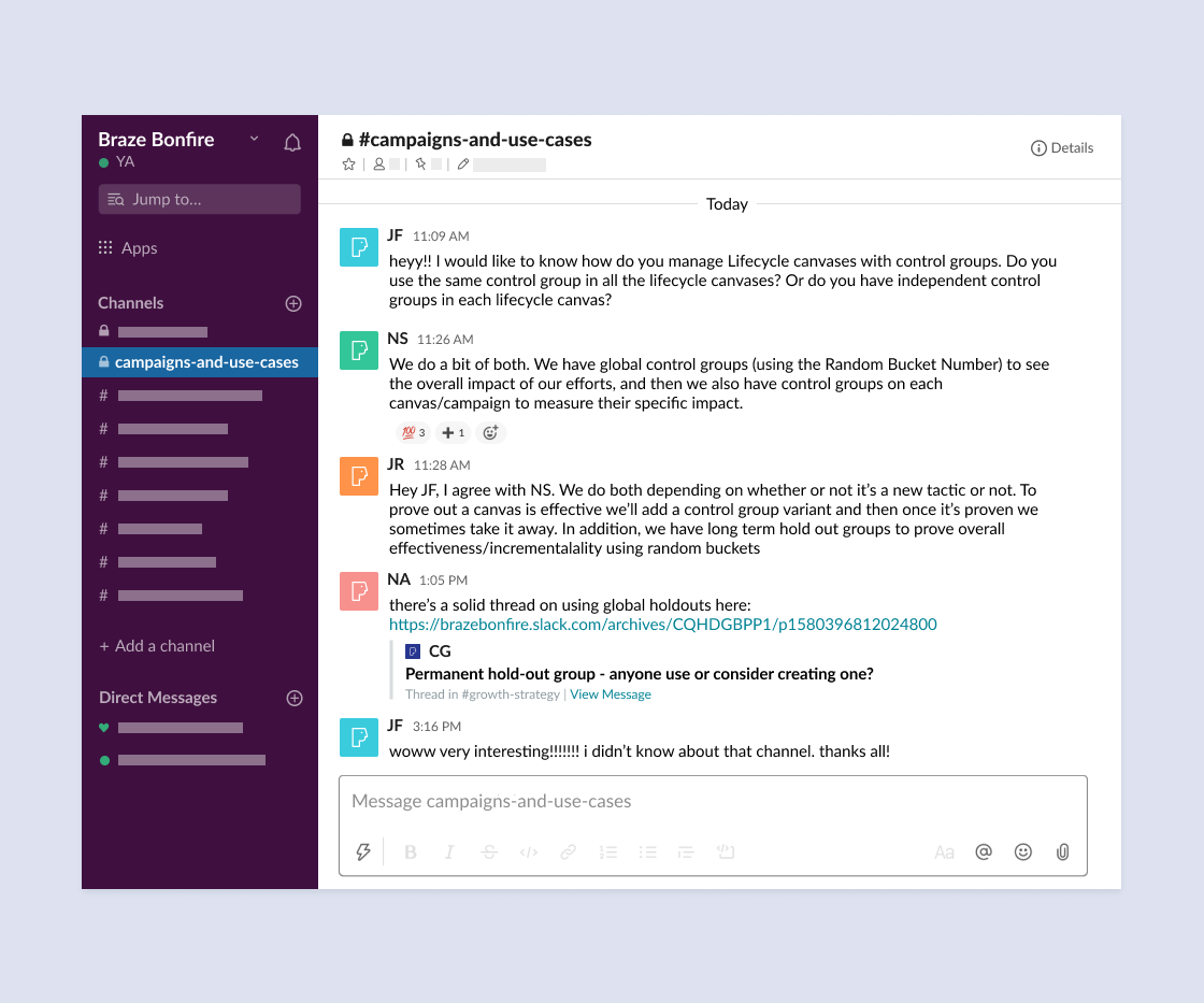
At Braze, our product team has long taken a customer-centric approach to the user experience, an approach built around continuous iteration and improvement of our product based on what we’ve learned from customers. In recent years, the Braze Customer & Partner Marketing team has shepherded Braze Bonfire, a Slack group for marketing, growth, and product team members, into a tight-knit community of Braze users dedicated to helping each other succeed. Members of this community are important partners for us when we’re investigating elements of the Braze product’s UX, giving us meaningful, actionable insights into how real Braze customers use and perceive what we’ve built.
Our Product Design team has traditional run usability tests via video chat. However, depending on the feature we’re looking at, this approach to testing can take an undue amount of time and energy for our team, as well as the end users who are generous enough to volunteer their time. So, we decided to try out Maze to see if we could use this solution to more easily carry out usability testing at scale.
The Usability Testing Process at Braze
Before getting started with usability testing, you need to make sure your prototype is ready. At Braze, that means using collaborative interface design tool Figma. In the case of our MMS feature, we followed that by testing the prototype with a couple people internally, allowing us to flesh out our initial hypotheses and identify a couple of important details.
Next, we took the following high-level steps in order to run usability testing at scale:

1. List Hypotheses/Questions
This step requires Product Design teams to consolidate any hypotheses/questions that surfaced during the design process—which includes prototyping, internal testing, and design reviews—in order to ensure that their usability testing is looking at the right things. For us, designing our MMS prototype led us to the following hypotheses and questions:
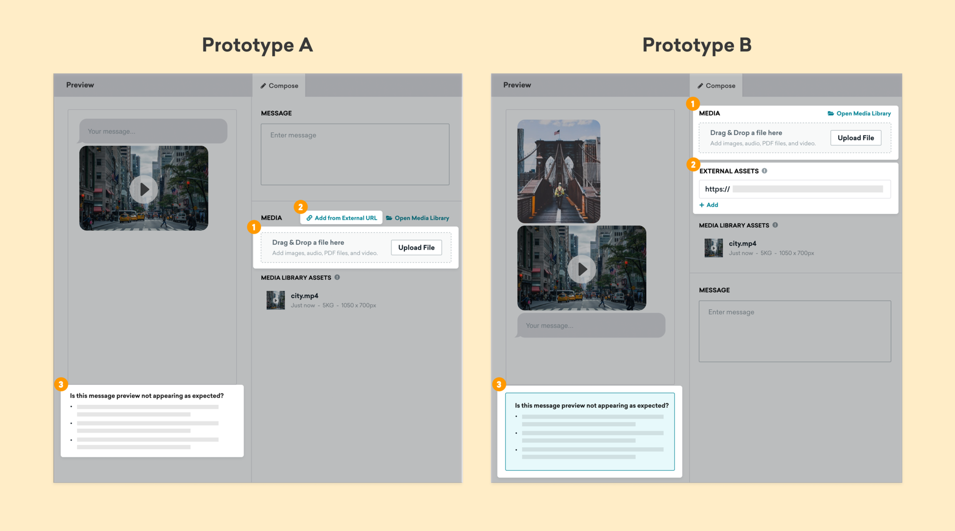
- Adoption & Understanding Workflow: Can we encourage users to upload media files first if that’s the first item they see when using this feature?
- Usability: Will users be less likely to upload non-Braze-hosted assets (images, GIFs, etc.) if that option is displayed as a tertiary button versus a stand-alone field?
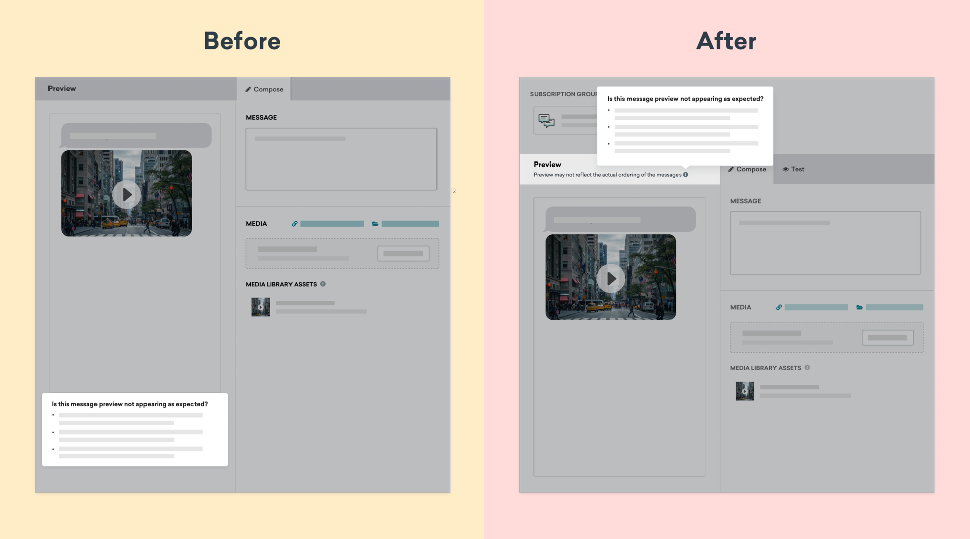
- Visual Communication: Will users be more likely to understand that they can’t control the ordering of MMS messages if we include a more visually prominent banner in one of the prototypes’ preview views?
2. Set Up and Launch Prototypes
Moving from prototyping to actual testing can be complicated at times. But one big benefit of using Maze became clear during this stage, when the new Figma/Maze integration made it possible to seamlessly import our Figma prototypes into Maze and then design a custom survey to capture both quantitative and qualitative feedback on our prototypes. We set up two separate tests (rather than A/B testing in a single test) because our prototypes had different layouts and flows. We wanted to be able to tailor our surveys to match each experience being tested, something that leveraging Maze and Figma together made easy.
We’ve found that once you import your prototypes and select your happy paths, it’s smart to add some feedback questions to get additional context from users. Here’s what we ended up askings them during the MMS usability test:
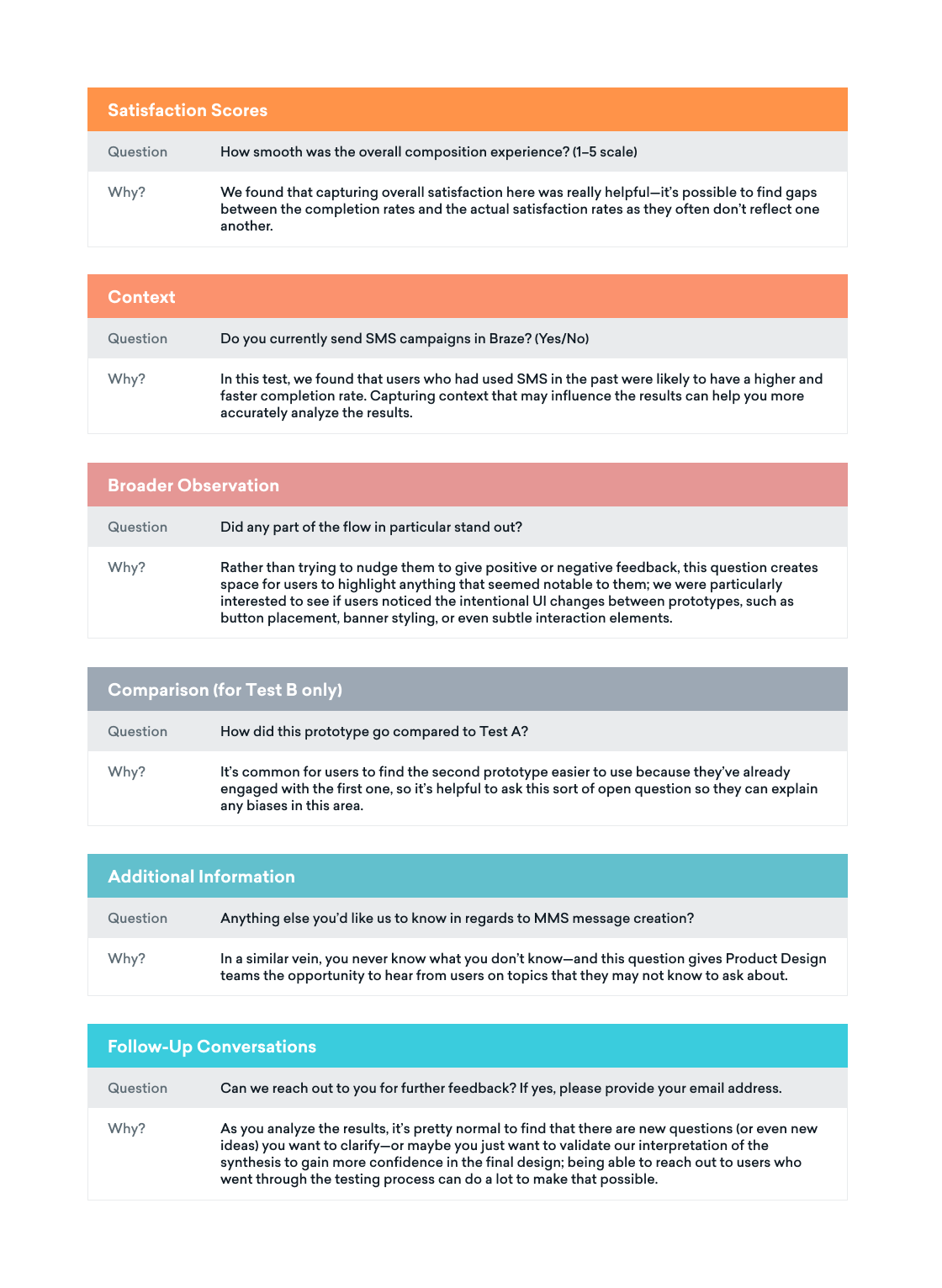
Once your questionnaire is set up, it’s a good idea to add an introduction and guidelines to your test, just so all the users are clear on what they’re being asked to do and how they can make their voices heard effectively.
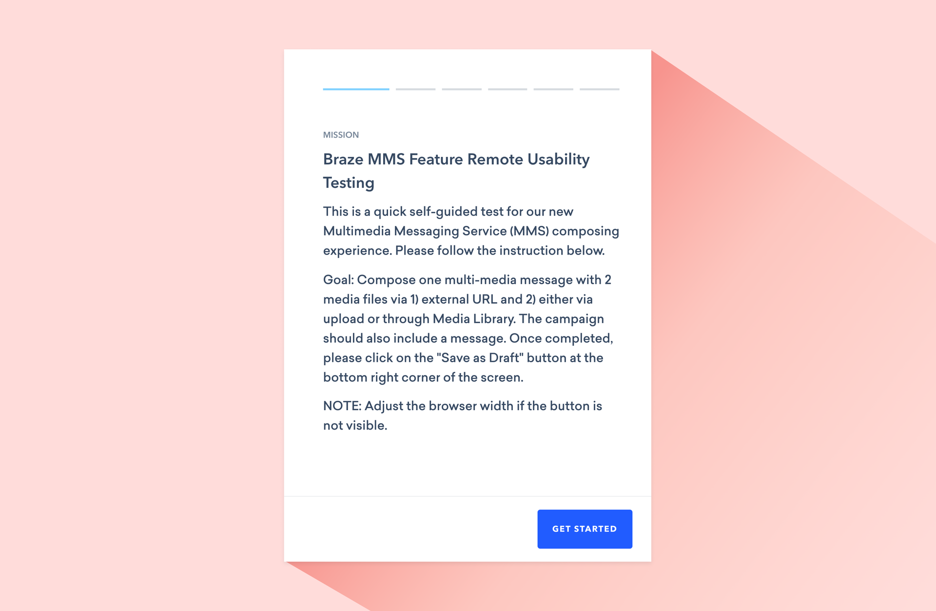
Then it’s time for a dry run! We tested our MMS prototypes with a broader subset of the Braze Product team and slightly tweaked the questions we were asking based on their feedback. Once we were happy with everything, we reached out to the Bonfire community to recruit people who expressed interest in testing our MMS workflow. Interested people were invited to a private Slack channel that we created specifically for testing, and were given links to the two prototypes with accompanying instructions.

3. Analyze Usability-Testing Results
For our MMS prototyping usability test, we ended up with more than 20 test participants. It took them less than a week to complete the test—but one great thing about remote testing is that it makes it possible to start collecting qualitative data as soon as the first user completes testing. Then, once all the participants were done, we were able to start looking at quantitative results (e.g. overall satisfaction scores).
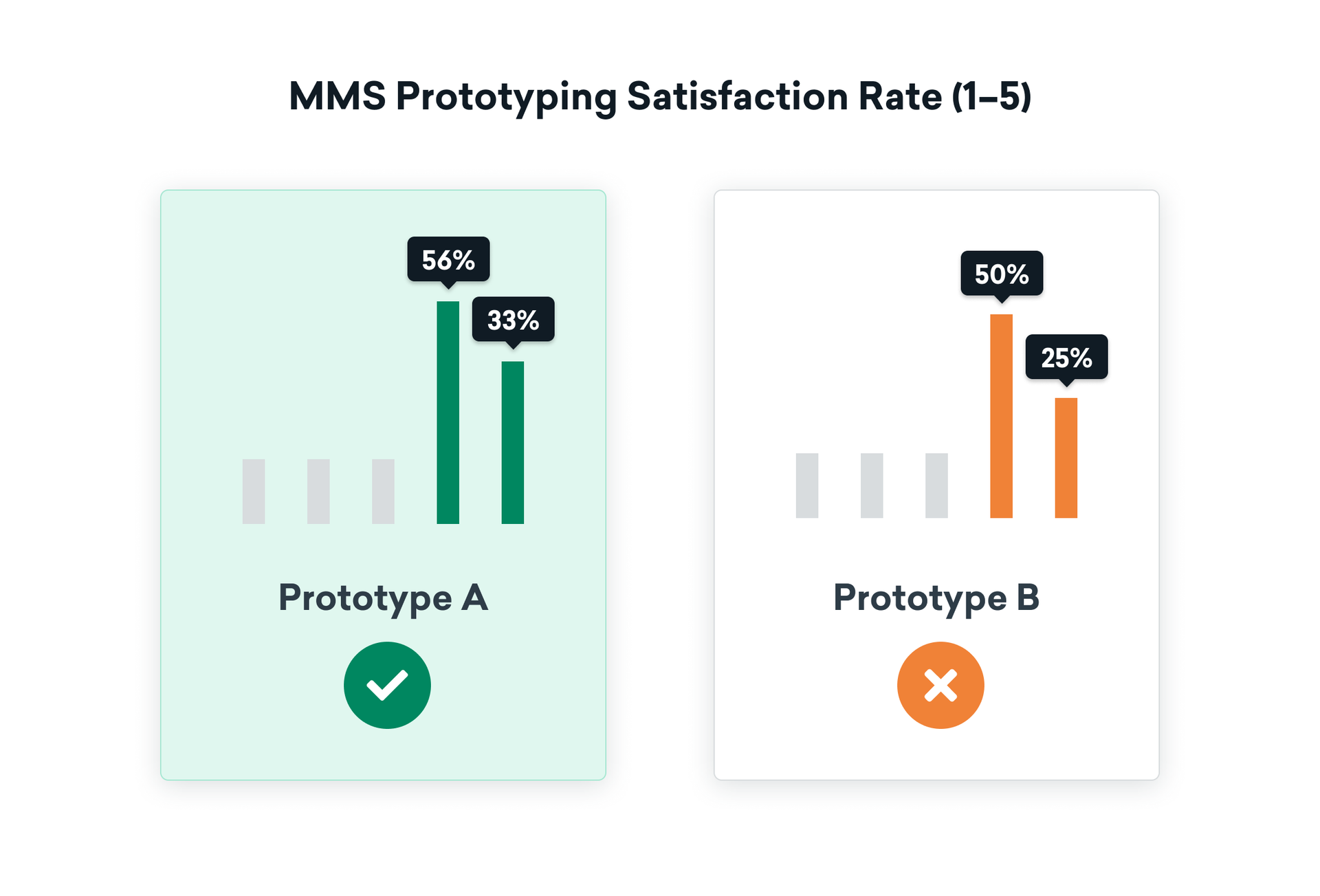
When it came time to synthesize our A/B testing results, we started out by looking at the qualitative data from the survey and noting common themes. Then we looked at the overall satisfaction rate:
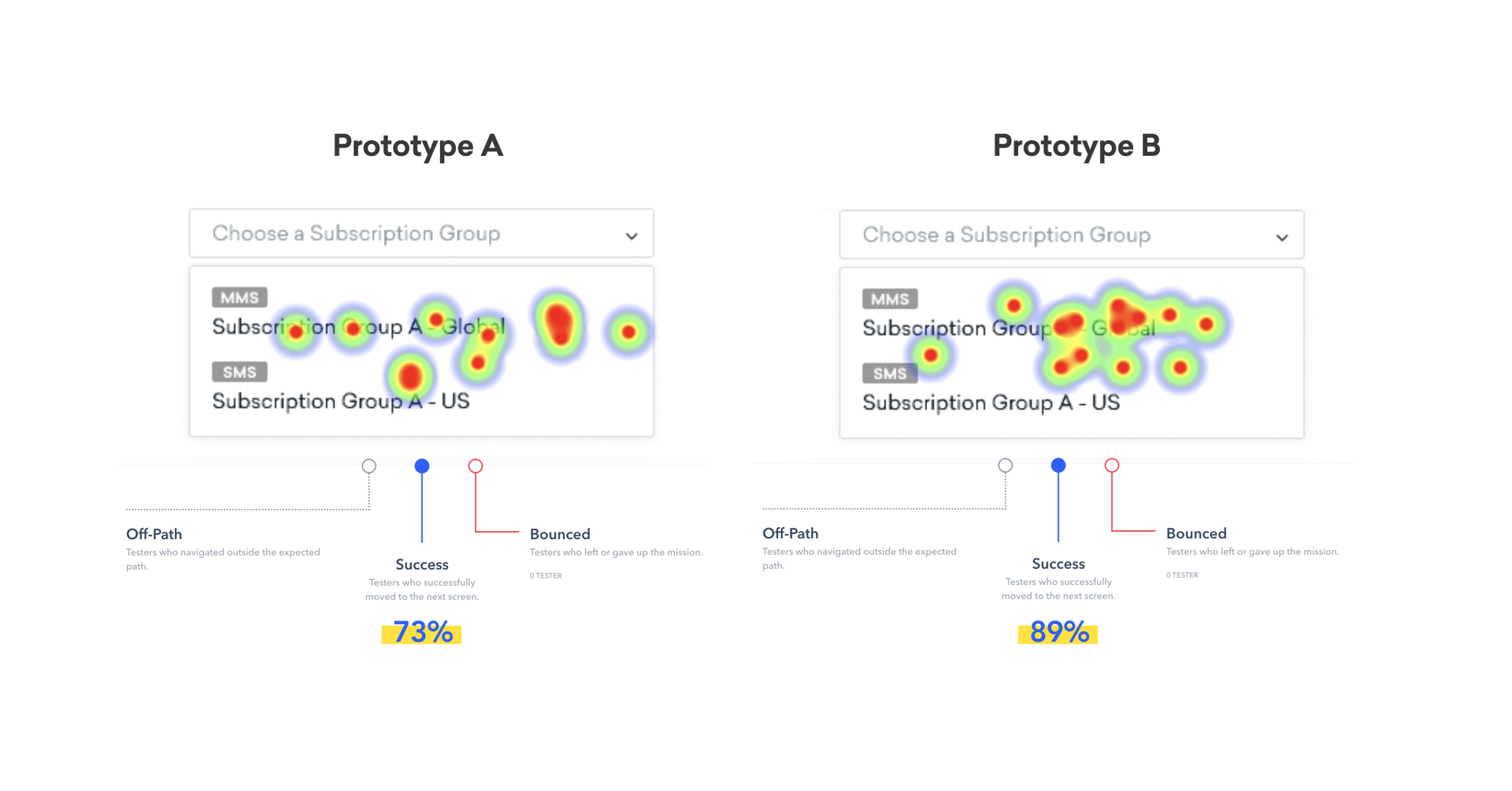
Our next step was digging into the interaction heatmap for each prototype that was generated by Maze. Because we were working with a smaller group of testers, we focused on analyzing each user’s path and interaction behaviors in order to identify (and screenshot) common behaviors and how often different actions occurred.
What does that look like? To give one example, we found that the overall success rate associated with clicking on the right dropdown option with the MMS tag was 81%. But that rate was 16 points higher for prototype B, suggesting that users were learning how to use the prototypes as they interacted with them. To further improve the experience, minimize friction, and get the success rate up to 100%, we’re taking these insights and using them to improve the way we display SMS/MMS in the Braze dashboard.

Supercharging Usability Testing Speed-to-Insight with Maze
From the moment we launched our usability test, it took only a week to get useful results—and we were able to begin synthesizing results as each user response came in, giving us a real-time picture of how the tests were progressing. That speed and clarity was a big plus. It usually takes about 11 hours of video-conferencing time to get similar insights under our previous process, and with the added time associated with reaching out to Braze customers, coordinating schedules, and scripting the test, it would have taken at least 2–3 weeks to complete testing without leveraging Maze.
Using Maze has supercharged our Product Design process and made it possible to drive faster turnaround times, speeding up product iteration and making for a better, faster end-user experience. And as Braze continues to scale its Product Design team, we expect tooling to play an integral role in how we operate. By exploring and leveraging tools like Maze, we’re investing in the long-term work involved in building Braze, providing a better experience to our end users and pushing the boundaries of what’s possible with our product.
Interested at working at Braze? Check out our current job openings!
