Building Braze: Dark Mode
Published on February 14, 2020/Last edited on February 14, 2020/6 min read

Sarah Wilson
Senior Product Designer, BrazeThat’s certainly the case at Braze. In my role as senior product designer for the Braze Platforms & Channels team, I spend considerable time working alongside the Braze Product Management and Engineering teams to investigate potential features to support the operating system and device updates announced by Google and Apple each fall. We design and build the iOS, Android, and Web software development kits (SDKs) that power real-time messages and track user engagement in our customers’ apps and websites. Not only do our customers rely on these SDKs to send billions of messages each day, they depend on Braze to help them understand the impact of Android and iOS changes on their products.
But while that process is an essential part of the work we do here at Braze, it can sometimes be hard for people on the outside to understand how we approach these efforts and the (exciting, but also challenging) decisions we make along the way. So let’s take a look at a recent Braze product release that exemplifies the complexities and rewards of how we handle new product features: Dark mode support for in-app messages.
Staying Ahead of the Curve: Planning Dark Mode Support (Before Dark Mode Even Launched)
This year, both Google and Apple announced plans to release dark mode styles for their mobile operating systems, making dark mode–compatible apps and messages a key need for brands on those platforms. Following the announcements, we began asking ourselves: How might Braze support dark themes for our in-app message templates? We knew we needed to have, at the very least, a solution that checked the box of supporting both light and dark themes for a given message. So, we set off defining an Minimum Viable Product (MVP) with the following qualities:
- Fits common customer use cases, can be adopted widely
- Requires low lift from customers, can be implemented easily
- Discoverable and intuitive, can be used without error
In a typical product development process, we would test and validate an MVP solution after conducting a detailed competitive analysis, working to understand customer needs and motivations related to the potential new product feature, and identifying possible barriers to customer adoption (and how to address them, if possible). With Dark Mode support, however, we were trying to scope the project months before the global release of Android Q (or Android 10, as it ended up being called) and iOS 13.
The upshot? There was just a lot less information at our disposal. We had no competitive features to analyze—because none of our competitors was supporting Dark Mode yet—and almost no signal on customer needs and motivations, because they’d just found out that Dark Mode was going to be a significant thing for the future of their apps. That made it challenging to explore potential barriers to adoption.
To kick things off, we decided to explore a series of solutions and assess whether each out met or failed the following criteria:
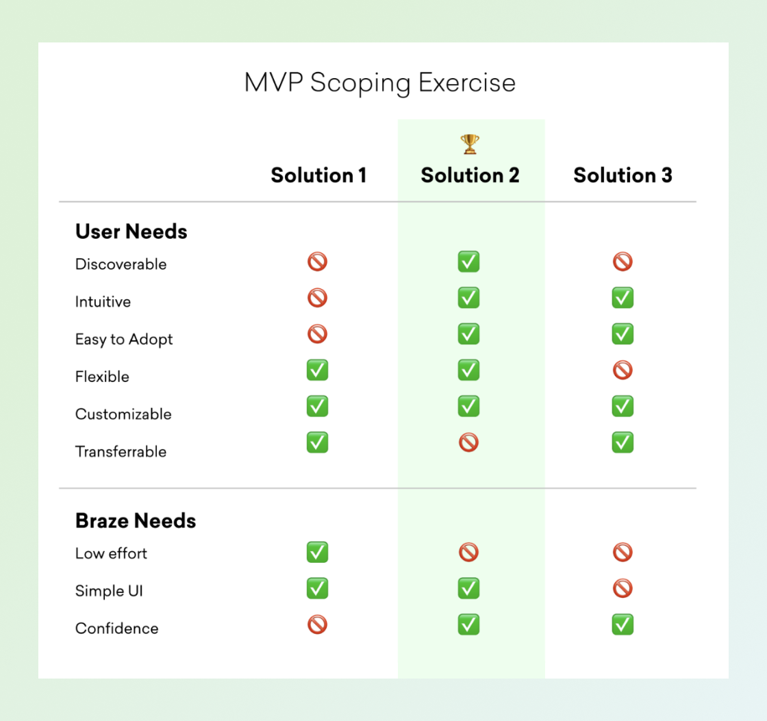
When an organization does this kind of scoping, they’re generally not going to see one option meet every possible criteria put in front of it. The goal is to ensure that you’re taking into account all the different pros and cons of a given approach and thoughtfully assessing the realistic options in front of you before making a decision.
That’s what happened here. After reviewing the table with key stakeholders across the Product and Engineering teams, we agreed that Solution 2 was the way to go. While this solution required more effort from our engineering team, we chose it because of its greater discoverability within the product and lower barrier to adopt. We were also sure that Dark Mode would catch on and that a lot of our customer’s users would start turning it on for their apps—which made it essential for those customers to be able to send in-app messaging campaigns in Dark Mode, too. To address that need, we had to make sure that our Dark Mode support could be implemented both by the most sophisticated product teams (which happen to describe most Braze customers) and organizations where engineering resources might be hard to come by.
From Testing to Launch: Making an MVP
Once we had a clear path forward, I knew what I needed to do: Whip up a prototype of what we were looking to build to support user testing. But while we’d normally conduct usability testing directly with our customers, we didn’t have that luxury this time—for one thing, many customers didn’t know what Dark Mode was at the time. Instead, we ran usability tests with some of our favorite folks from the Braze Success, Support, and Marketing teams. While this certainly doesn’t replace or equal the feedback directly from customers, it helps us to mitigate some of the risk as we move quickly towards a release.
With their insights in mind, we came up with the following MVP:
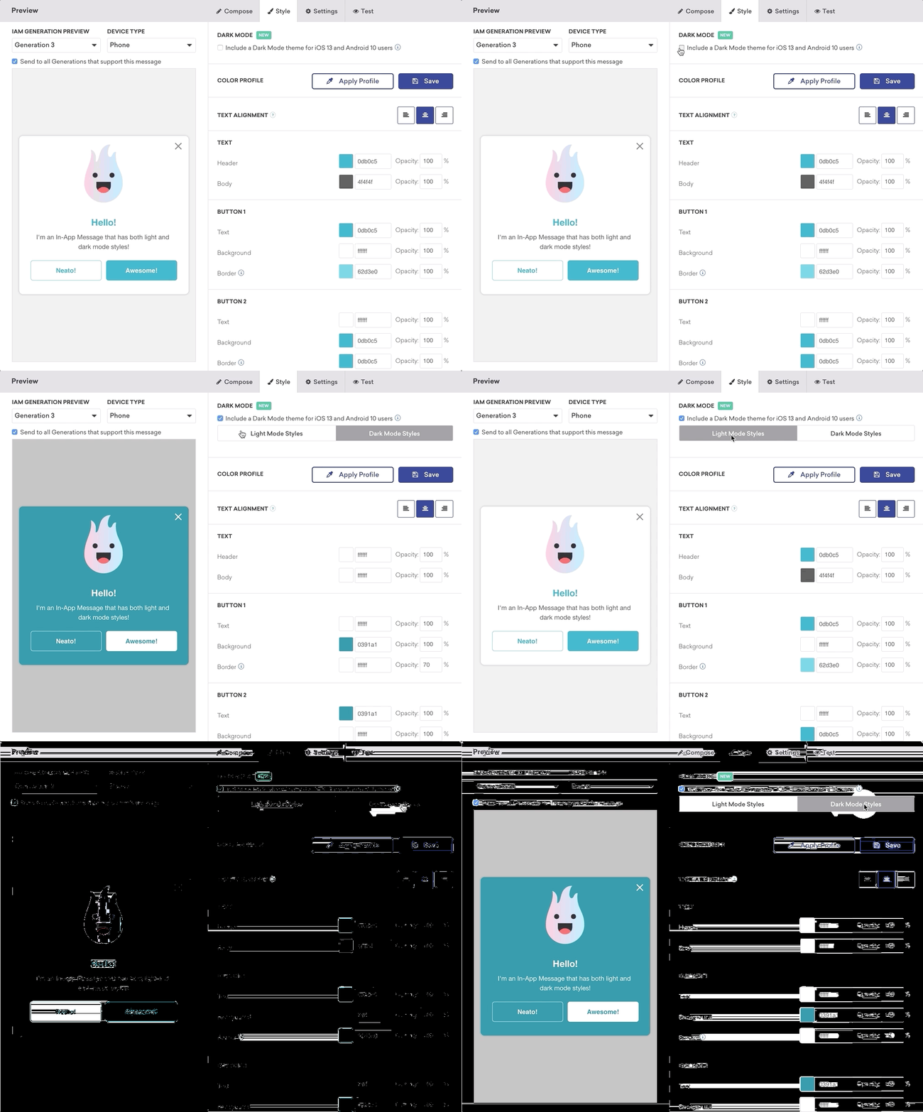
By quickly collecting feedback on the usability of our prototype through internal testing, we were able to build out a MVP version of Dark Mode support that was simple, easy to use, flexible...and ready for our customers to take advantage of in a timely manner.
And here we are—with our feature available and being used—just a few months after Dark Mode was widely released and adopted by app developers across the globe. Our team is continuing to onboard Braze customers and proactively ask for feedback to better understand barriers to adoption, usability concerns, and feature requests. As an agile team, we’re dedicated to continually measuring usage, considering incremental improvements, and ensuring that we’re receiving direct customer feedback when it comes to the features that matter for their customer engagement efforts.
Final Thoughts
You may be wondering what motivated a designer to write an article exploring product management decisions, engineering investigations, and a design solution that ultimately required only the addition of a single checkbox to the Braze dashboard.
The truth is, I’ve seen a fair amount of buzz lately surrounding business-minded designers and the role they can play—and, from my perspective, this is a great example of a product manager, product designer, and engineering manager working in a tightly integrated fashion to balance business, user, and technical needs. My role in this project was less about my expertise as a traditional designer and more about my ability to navigate ambiguity, get creative when it comes to research methods, and advocate for predicted user needs.
If you enjoying tackling and building these sorts of complex, ambiguous problems as much as I do, check out our open job postings.
