The 9 Best Push Notifications We Received This Week
Published on March 11, 2016/Last edited on March 11, 2016/7 min read


Todd Grennan
Content Production Principal, Content Marketing at BrazeIt’s hard to imagine mobile without push notifications. This powerful messaging channel first came to prominence as a mobile outreach type—though it’s now available for web and wearables—and over time it’s become an essential part of the modern mobile marketing toolkit, powering re-engagement campaigns and supporting multichannel messaging strategies for many brands.
But that’s only if your customers agree to receive them. Appboy (you know, the people bringing you this blog…) has found that only 40% of iOS users and 60% of Android users enable push notifications. Brands can improve their push opt-in rates by making sure to ask customers to enable push notifications in a thoughtful way. But that’s only half the battle: make sure that the push notifications you send are relevant and valuable to recipients to keep them opted-in. Right now, 78% of people report that the majority of the push messages they receive are irrelevant. That’s a big problem—especially when you consider that more than three-fourths of customers will opt out of push or uninstall if they get messages they’re unhappy with.
Okay. So you need to be sending great, relevant push notifications. Fine. But what do great push messages actually look like? To find out, we asked nine Braze employees to track the best push notifications they receive for a week and report back on their favorites—what they looked like, what they said, whether they used emojis, and whether they clicked on them. It’s not statistically significant, but it IS interesting.
Here’s what we found:
1. No vertical has a monopoly on great push notifications
BrandVerticalsSwarmSocial NetworkingTimehopSocial NetworkingiHeartRadioMusic & AudioiMessageMessagingArgusHealth & FitnessDuolingoEducationThe OutnetShoppingMicCheckNewsTinderLifestyle
The push notifications that our respondents highlighted came from a wide variety of industries. Push notifications from social networking apps were cited by two respondents, making it the only vertical to be mentioned more than once. Whether you’re a news app, a shopping app, or an education app, it’s possible to send push that really speaks to your recipients.
2. Brands are sending a lot of push notifications
BrandPush FrequencyDuolingoDailyTimehopDailyThe OutnetDailyiMessageDailyiHeartRadioEvery couple daysSwarmEvery couple daysMicCheckEvery other weekArgusLess than one per monthTinderLess than one per month
Among the nine brands identified by our respondents as sending the best push, 44% send push notifications daily and another 22% send messages in this channel every couple days. While push fatigue can hurt engagement, it looks like brands can send push notifications daily if those messages provide enough value to recipients.
3. When it comes to push notifications, emojis are definitely in
BrandUsed EmojisiHeartRadioNoiMessageNoSwarmNoDuolingoNoMicCheckNoTinderYesArgusYesTimehopYesThe OutnetYes
We’ve been covering the growing popularity of emojis for a while, but the results here really reinforced how big they’ve become. 44% of the cited push notifications made use of emojis, with one message from Timehop using three (💥💥💥) to get its point across.
4. Push notifications perform best when they’re short… but that doesn’t mean that longer ones can’t perform well
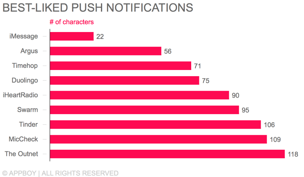
One major advantage of emojis is the way they let you convey complex things—countries, people, emotions, and more—in only two characters. Since push notifications that clock in beneath 25 characters have been found to perform best on Android and iOS, that’s a big advantage. But these results show that your push can still have an impact even if it’s longer than 25 characters. In fact, only one of the messages highlighted by our respondents fell beneath that level: a simple message notification from iMessage that was 22 characters long.
5. Great push notifications get opens—if that’s what they’re going for
BrandPush OpenediHeartRadioYesiMessageYesSwarmYesArgusYesTimehopYesThe OutnetYesMicCheckYesTinderYesDuolingoNo
Our respondents didn’t just admire their favorite push notifications; they took action! 87.5% of the push notifications cited by Appboy employees were also opened. The only exception was a message from Duolingo with no call-to-action.
What makes push notifications work: Appboy employees in their own words
The respondent: Sarah Madden, business development representative
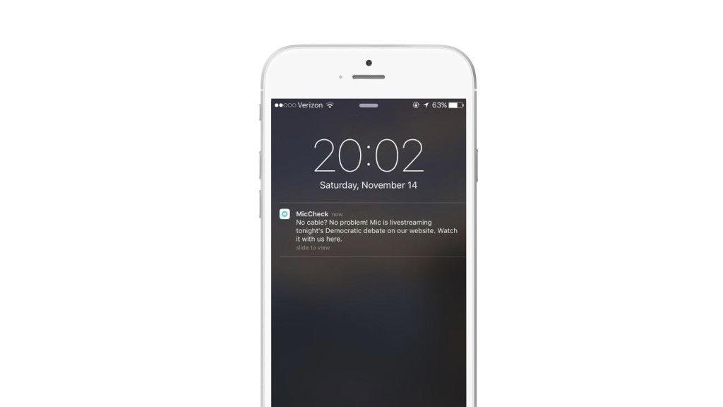
The app: MicCheck
What I liked about it: I liked this push notification because it was super relevant to me (interested in watching the debate, but don’t have cable, like most people my age—early 20s). I felt like this was a really personalized message, even though there’s no way to tell if this push was specific to me. It just provided a lot of value, right at the time that I was thinking “Where/how should I watch the debate? Everything I watch is through the internet!”
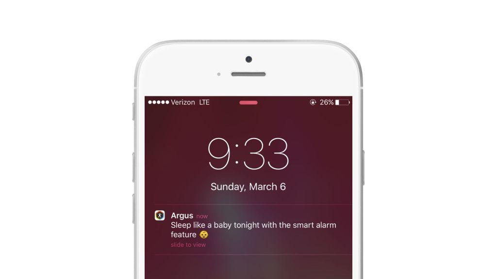
The respondent: Guillermo Olortegui, business development representative
The app: Argus
What I liked about it: A couple factors at play here. It’s a simple message that highlights a useful feature that I hadn’t used before. This is particularly smart if targeted to a specific segment (ex. users who only use the pedometer feature) to encourage broader use of the app. The timing made sense as 9:30pm on a Sunday is a safe bet for most users to consider sleeping soon after.
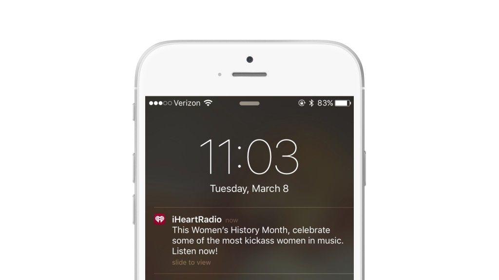
The respondent: Rachel Welber, customer success manager
The app: iHeartRadio
What I liked about it: I thought the copy was clever and there was a clear call to action related to the theme of the “Women’s History Month.” I received a lot of “International Women’s Day” push notifications, but none of them tied it back to their brand at all.
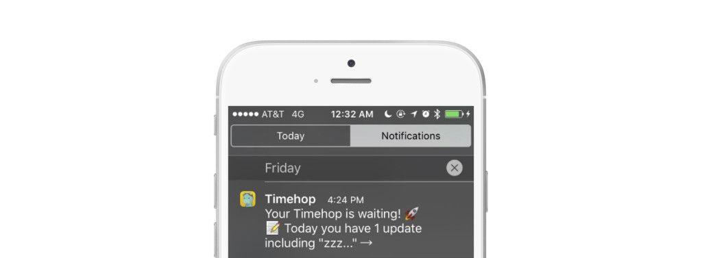
The respondent: Patrick Yeung, support engineer
The app: Timehop
What I liked about it: The consistent timely reminder and the short snippet of an old Facebook post makes me wonder what I posted that day. Every day Timehop’s push message is customized, but at the same time short and to the point 😊.
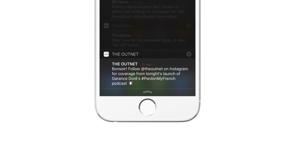
The respondent: Danna Ngo, marketing associate
The app: The Outnet
What I liked about it: It caught my interest because it was promoting an event rather than an item. I don’t know what the event is but it intrigued me enough to go find out. Plus, I’m a big IG [Instagram] person, which makes me even more interested.
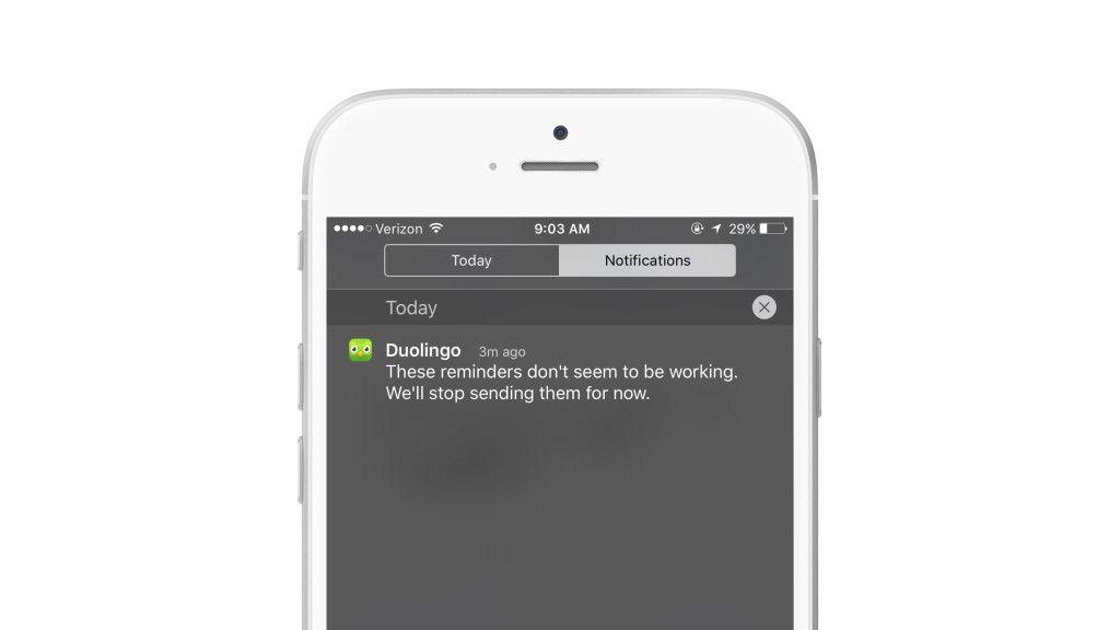
The respondent: Stella Kim, software engineer
The app: Duolingo
What I liked about it: Initially, the app sent me push notifications encouraging me to practice my Spanish daily. I actually didn’t respond to any of them (and didn’t practice) because I was pretty busy this week, and eventually I received this message. I thought it was funny they noticed that the messages weren’t working and decided to let me know they’re letting me off the hook. I liked that Duolingo tried to get me back to the app, but didn’t push so hard that it was annoying. It was also nice to know that they hadn’t forgotten about me.
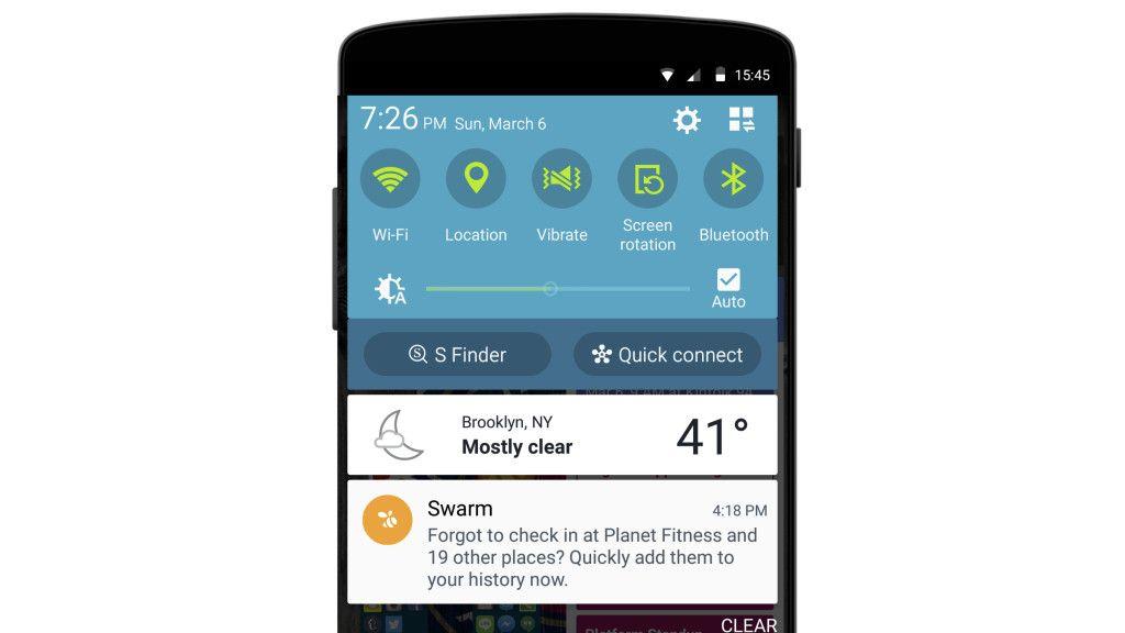
The respondent: Logan Yu, support engineer
The app: Swarm
What I liked about it: I enjoy using the app, but forgot about it. I like how it drew me back in by reminding me specifically of what I wanted to use the app for.
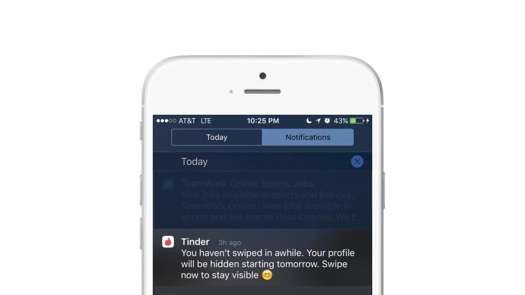
The respondent: Charles Lerner, business development representative
The app: Tinder
What I liked about it: Really, really good re-engagement, got me back after I didn’t use Tinder in probably over a month.
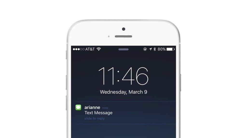
The respondent: Toks Fifo, software engineer
The app: iMessage
What I liked about it: I think messaging is one of the few classes of apps that justify push notifications—i.e. it’s possible for the content of a message to be time-sensitive. I also like that it shows me the exact amount of information that I want: who the message is from. (Although iMessage lets you personalize that by flipping a setting to show the content of the message, which is nice.)
The takeaway
There’s no one perfect push notification. (Thank goodness! Imagine how sick of it we’d be by now.) Your brand’s voice, value proposition, and mix of customers are all unique, and the push you send should be, too. But no matter what the goal of a given message is, make sure that the people receiving it find it valuable and relevant—otherwise, your outreach is going to struggle.
Push notifications work if your customers feel that they do. The push that our respondents engaged with were messages that (1) caught their attention, (2) provided real value, and (3) came at a time they were receptive to outreach.
How do you get there?
- Test the push notifications you send to maximize engagement.
- Use send-time optimization to make sure customers are getting your push at times when they’re most likely to engage.
- Pay attention to how your messaging is impacting push opt-outs and app uninstalls.
- Keep a close eye on how customers are experiencing your brand.
- And don’t get complacent! Your mix of customers and their preferences are going to change over time—make sure you’re taking steps to change with them.

